I am a Montréal-based product designer, focusing on web design, graphic design, interaction design, user experience, and user interface design.
As a designer, I believe it's key to be able to take yourself out of the equation, in order to collaborate with stakeholders to find the most impactful solution for unique situations. I am interested in the relationship between people and digital culture, and by humanizing digital spaces, I want others to feel empowered by their technology.
My international client roster includes startups, corporations, non-profits, NGO organizations and individual entrepreneurs, in a variety of diverse industries.
If you would like to get in touch about a project or to chat, please feel free to contact me: shannonmbain@gmail.com
“Shannon continuously exhibits a mindfulness and self-awareness key to her progress as a creative, a collaborator, and as a professional.”
Lindsey Carter
Residency Coordinator, District 3
“It has been a pleasure working with Shannon. She is talented, creative, professional and fun to work with. She responds well to working in a demanding and pressured environment whilst also delivering great quality work. Shannon’s impressive skills as a designer are a testament to her dedication and commitment.”
Rachel Dare
Creative Director, NewCities
All
Web
UX/UI
Graphic
I was asked by the startup company Sweeps to design their desktop and mobile app, which would be used in the development of the app and in product pitches.
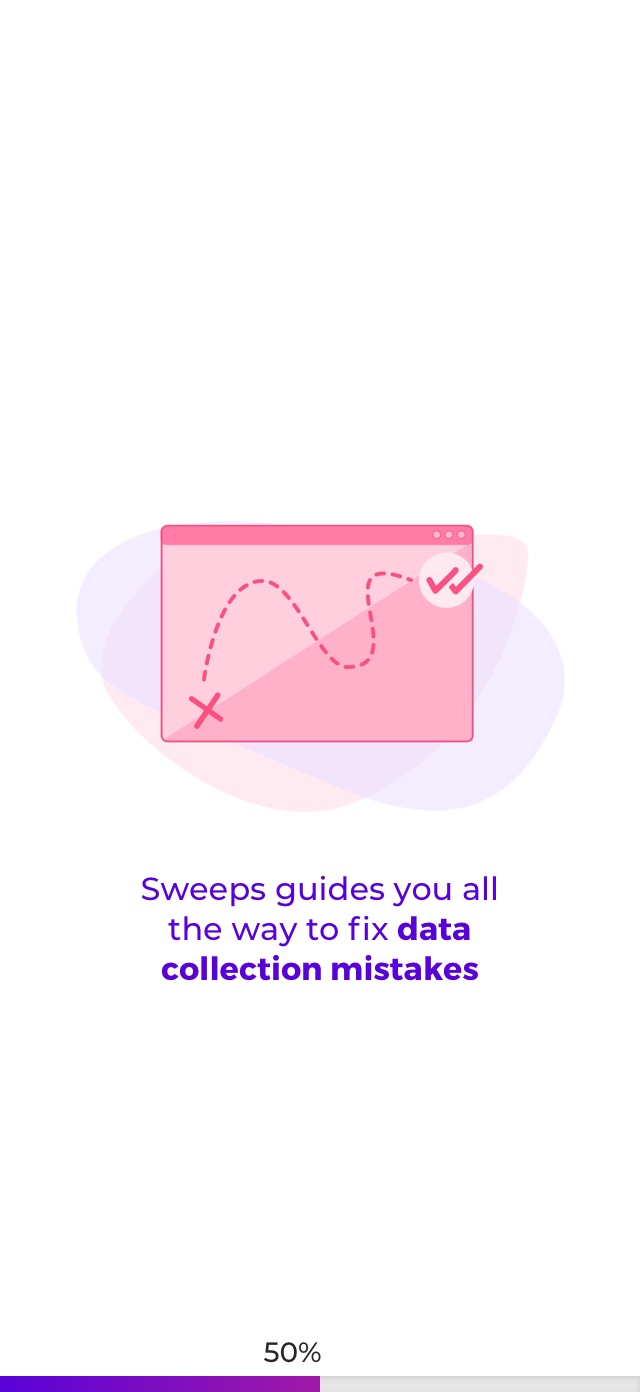
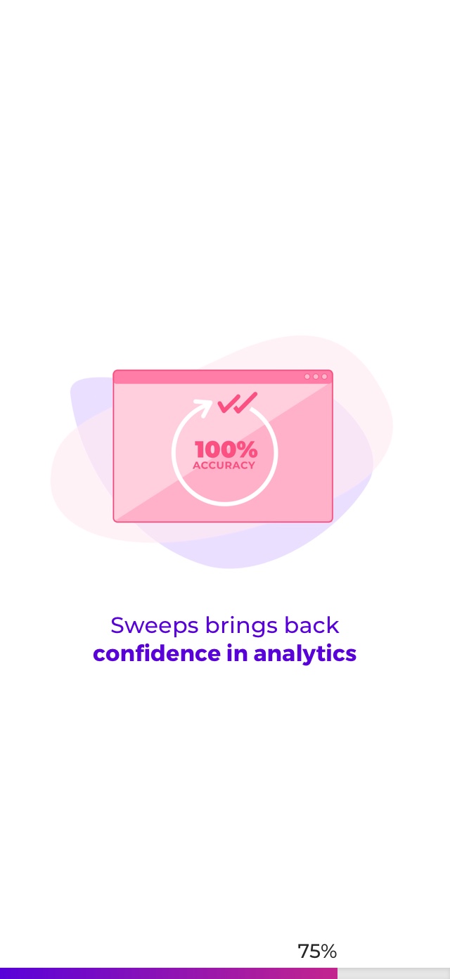
To support the design, I also created animations for the loading screens.
Date: Oct-Nov 2019
Client: Sweeps
Role: UI & graphic design, animation
URL: sweeps.ai
Sweeps allows users to scan their URL in order to see which of their analytics tools may be miscommunicating with their website. For this project, the focus was on creating the interface of a desktop and mobile app for clients to recieve their scanned report, and offers solutions to address the detected issues.
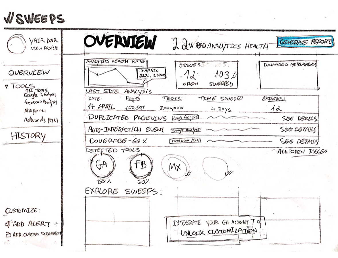
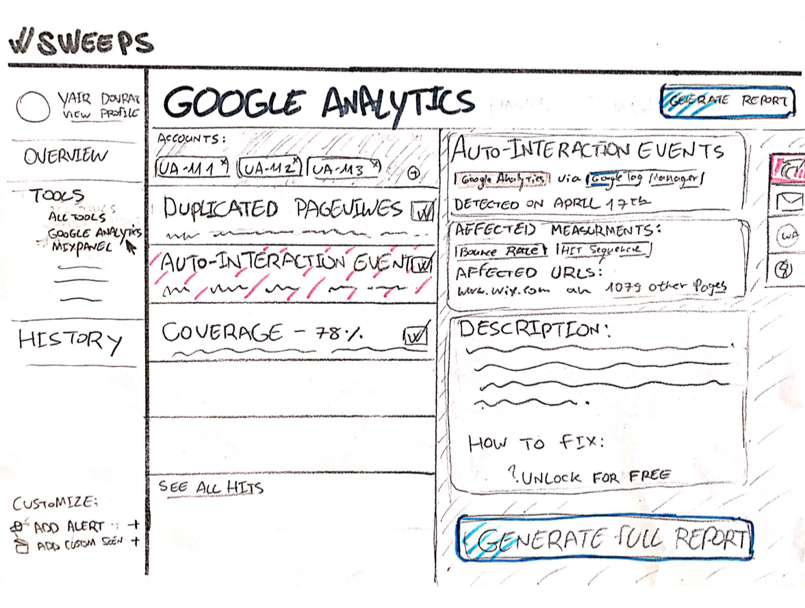
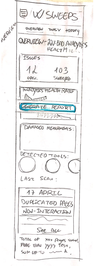
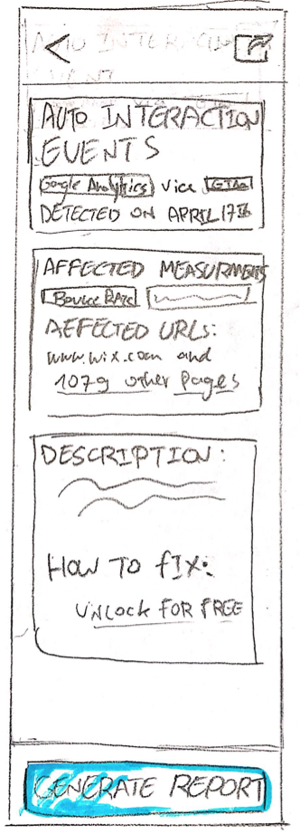
The project began by basing the interface off of Sweeps' sketches. We decided to use the conventions of a dashboard to present the different types of information, which would update and change with each new scan, as well as presenting more in-depth insight into the individual performance of tools.
Sketch of the dashboard design
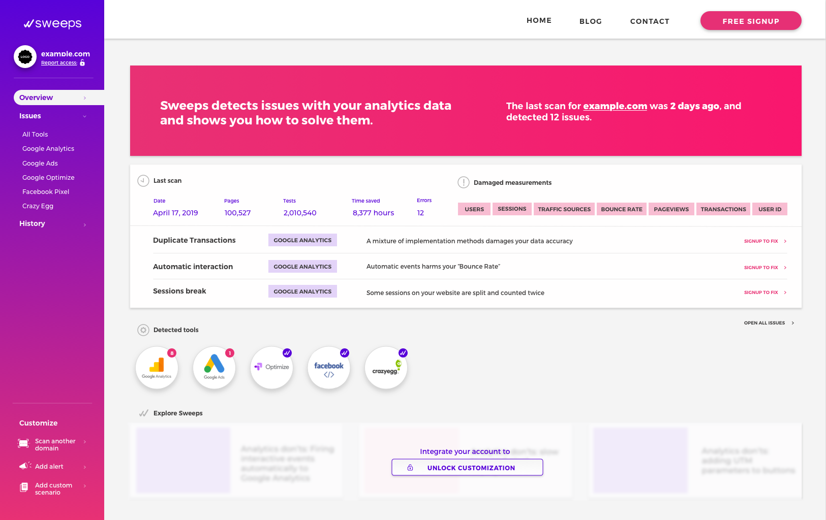
The purpose of the desktop app's homescreen was to give an overview-at-a-glance of major scan results and damaged measurements. Users are invited to explore ways to fix the damages. The principal call-to-action is to sign up for the service, to unlocking features and tools.
Sketch of the dashboard design
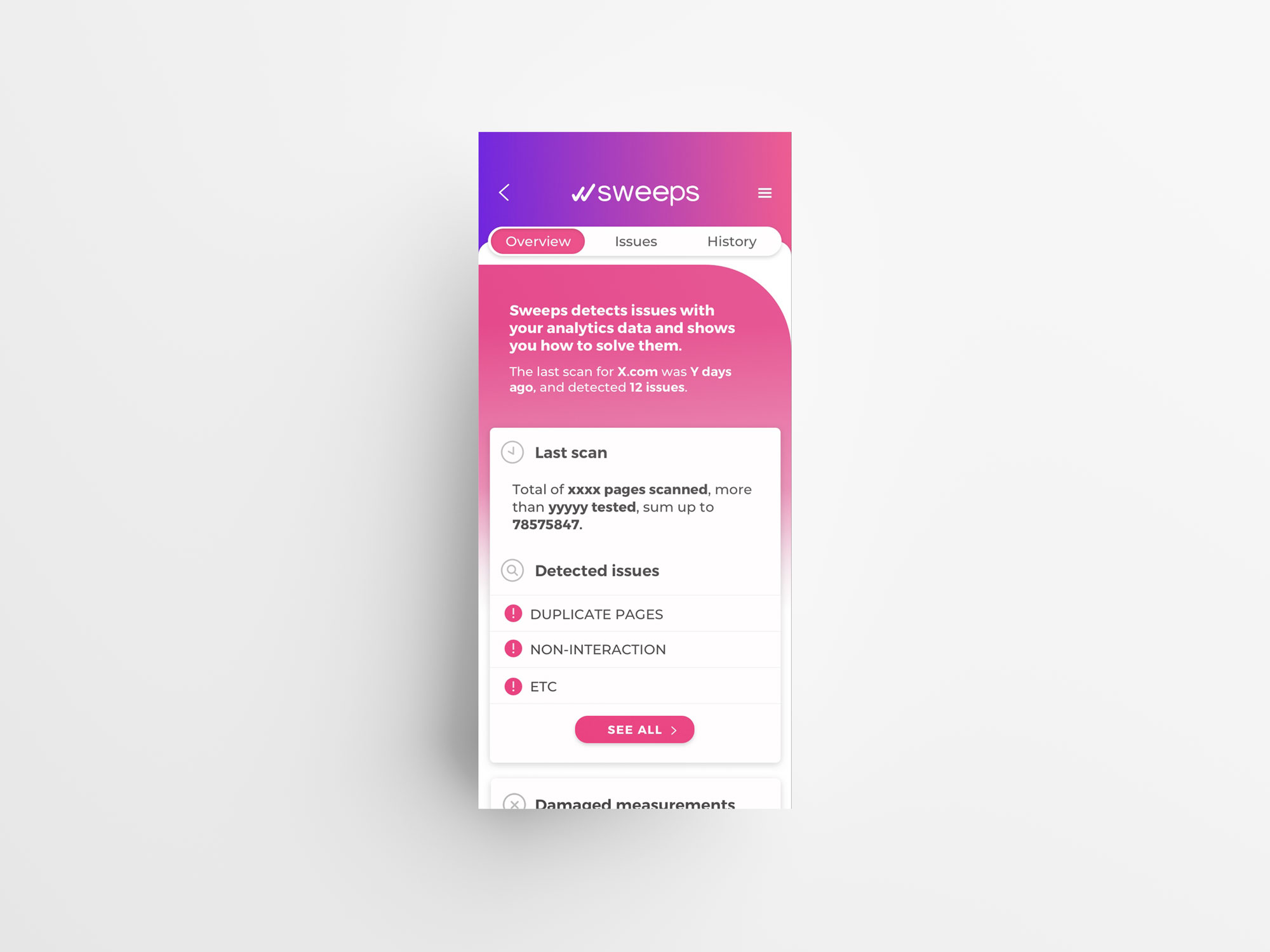
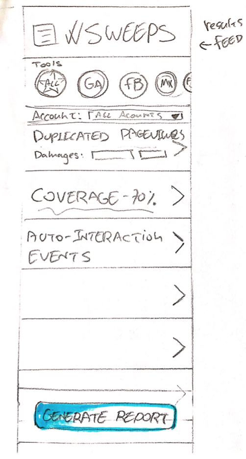
From here, I went about creating interactive prototypes of the interface, using Sweeps' branding. The information architecture of the dashboard was altered to facilitate a more intuitive user experience. At this point, we also developped the concept for the layout of the mobile application, which mirrored the features of the desktop application.
Sketches for the layout and information architecture of the mobile app
Homepage of the desktop app
Last scan and damaged measurements panel, giving an updated view of analytics health
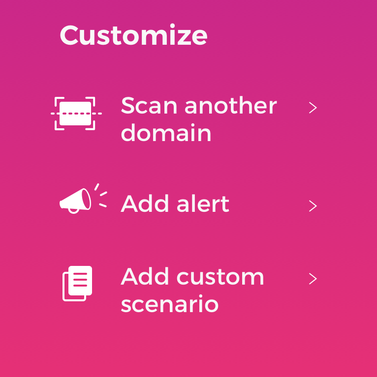
Left: Detailed view at the Customize section of the side navigation bar
Right: Detailed view of the detected damaged tool icon, with notification
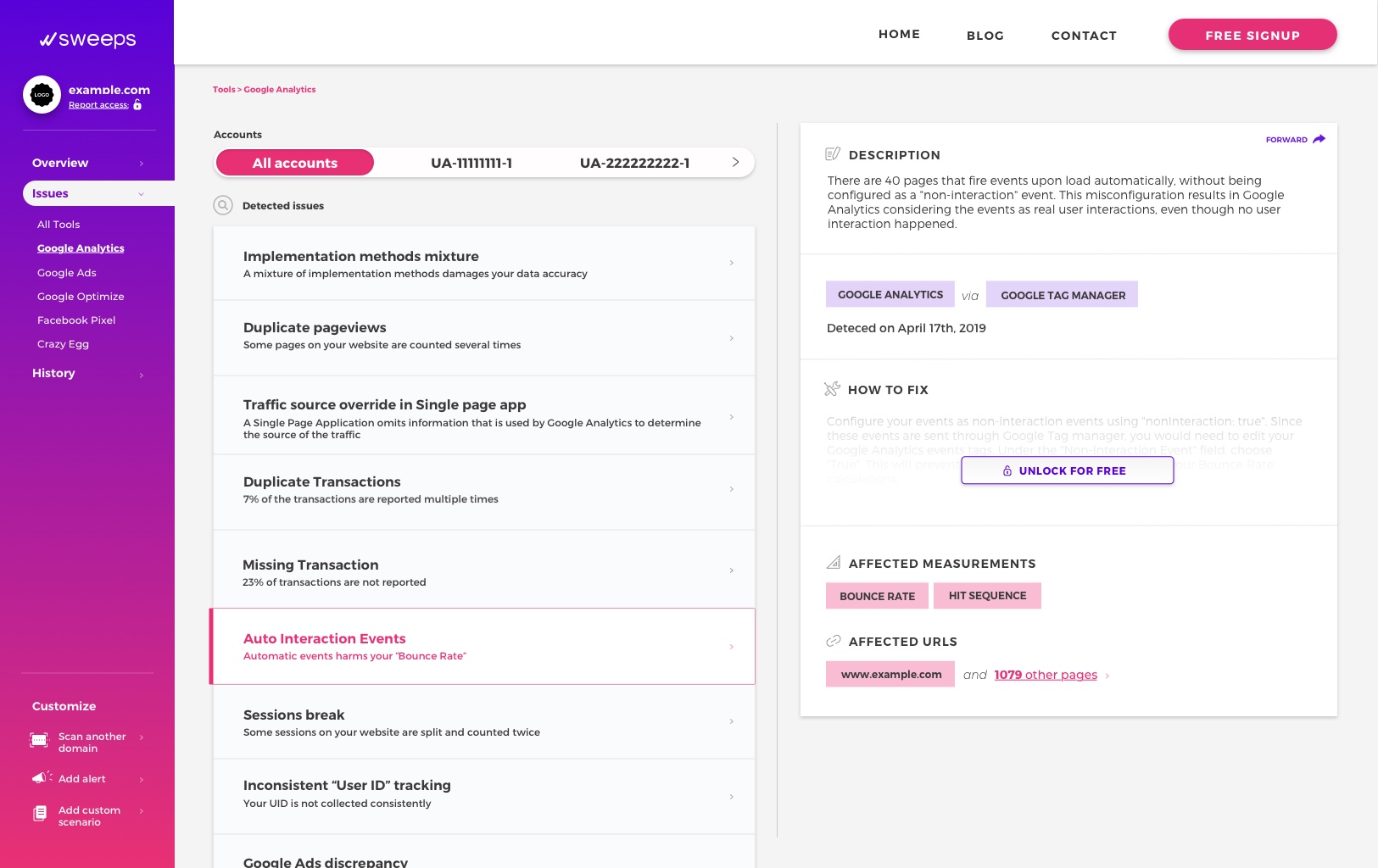
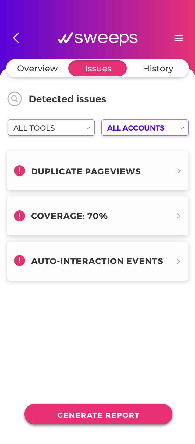
Issues page
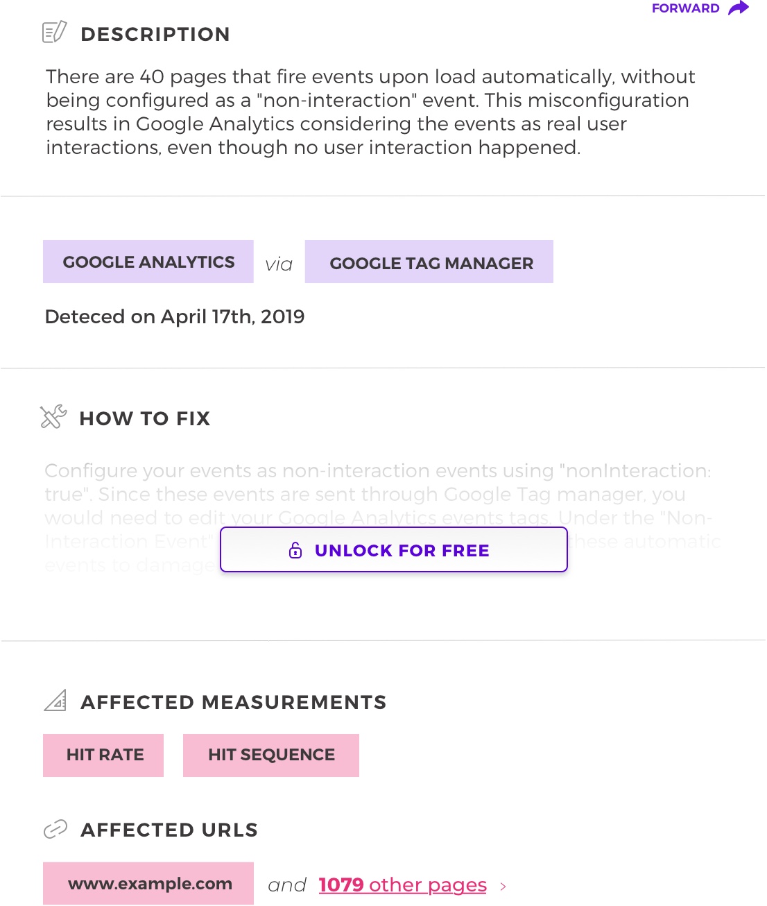
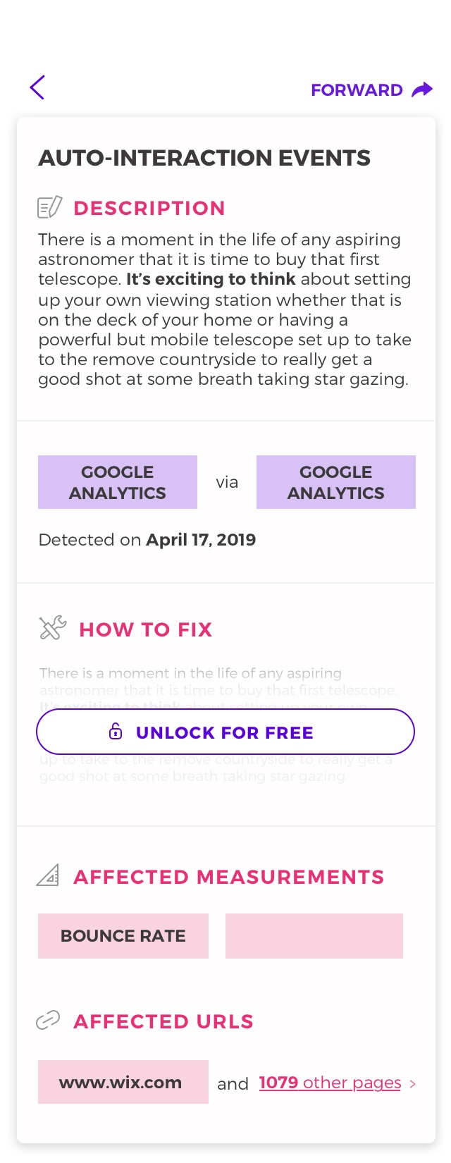
Left: Detailed view of the detected issue expanded panel. Users may unlock the feature allowing to see how to fix the issue when they sign up.
Final interface prototypes, based on preliminary sketches
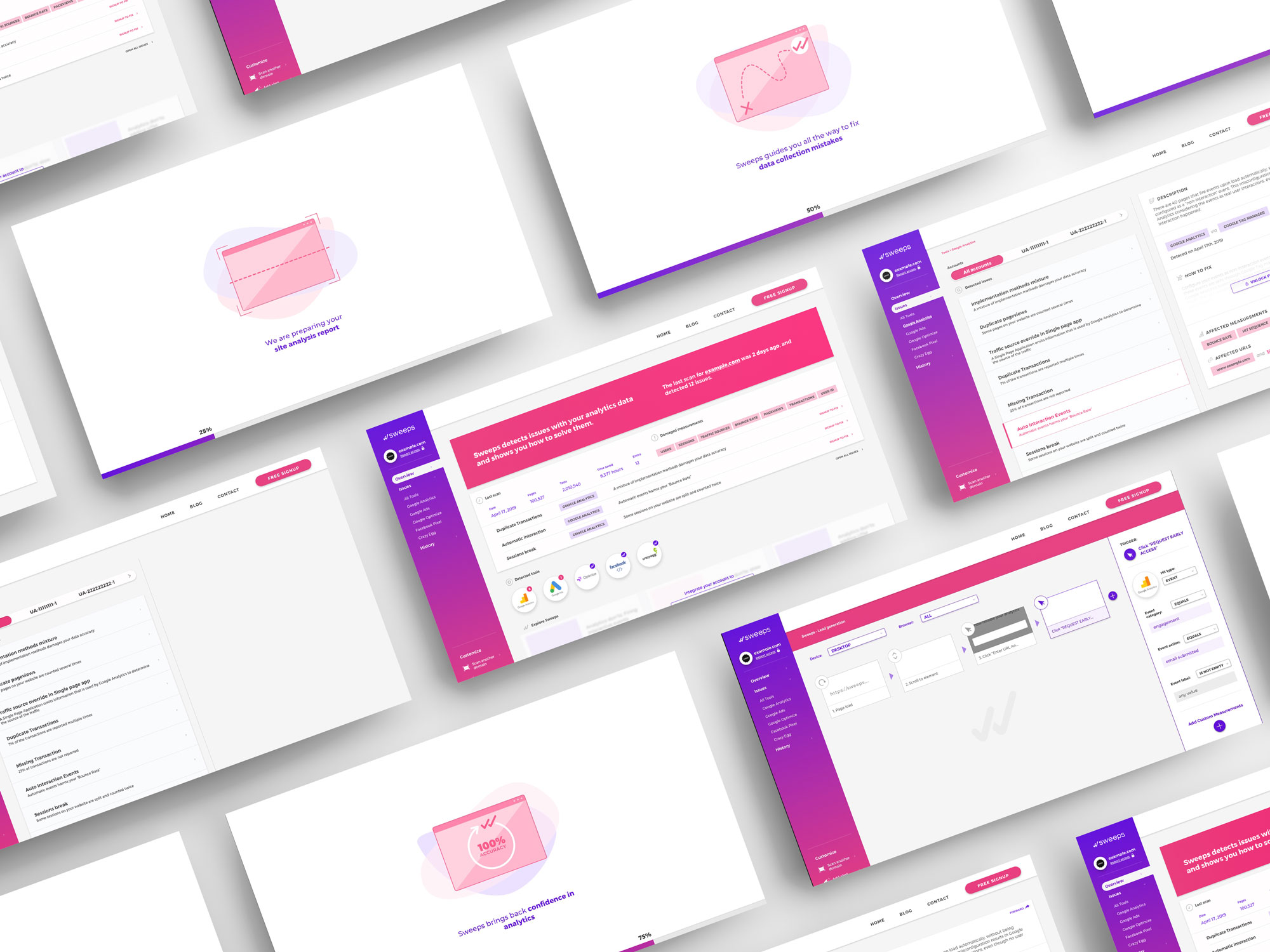
Animations for the tool's loading screens
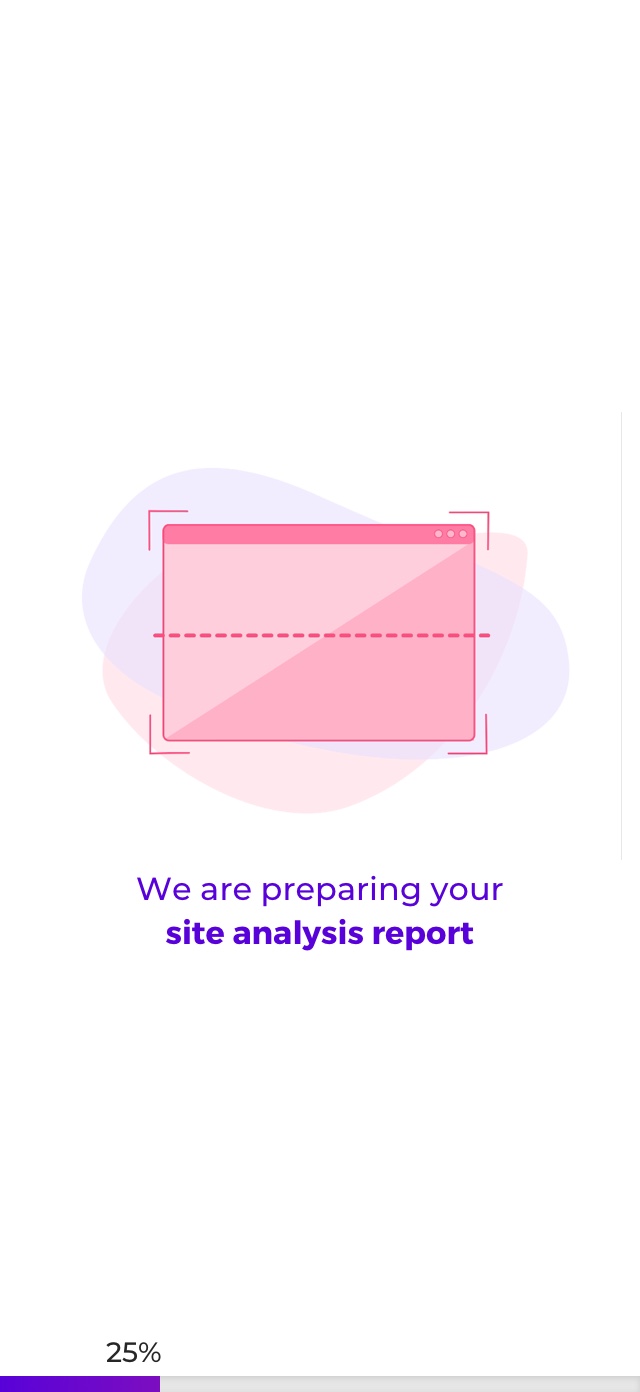
These animations were created to be used in the loading screen of the tool, so that the user would be reassured that the loading was deliberate, and to inform them about Sweeps' service offerings.
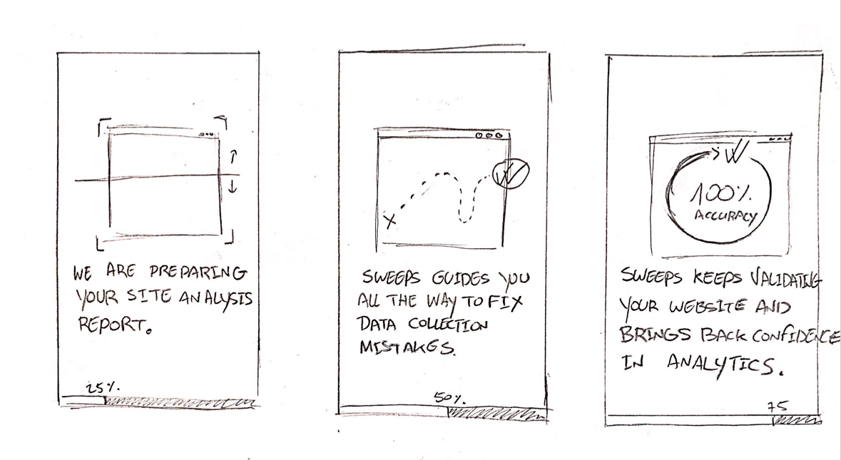
Sketches of the animations
I sketched the graphics out, based on Sweeps' ideas, and then scanned the sketches to trace them in Illustrator and develop them into fleshed-out illustrations. Then, I imported the vector file to After Effects and created the micro-animations.
Thumbnails of the animations in-situ on the desktop app
Thumbnails of the animations on mobile app
This website began as a personal project, stemming from interest in the subject and prior research into the environmental and ethical implications of factory farming, and was conceived as a way to communicate and inform about issues surrounding factory farming (industrial agriculture).
Date: April 2019
Client: Personal project
Role: Web design, graphic design, illustration, content creation
URL: /meating_demands
Factory farming is an issue I have been very passionate about for many years. Factory farming affects social, economic, environmental and ethical lines. It was important to me that the information I presented on the website to be clear and relevant, without resorting to sensationalism.
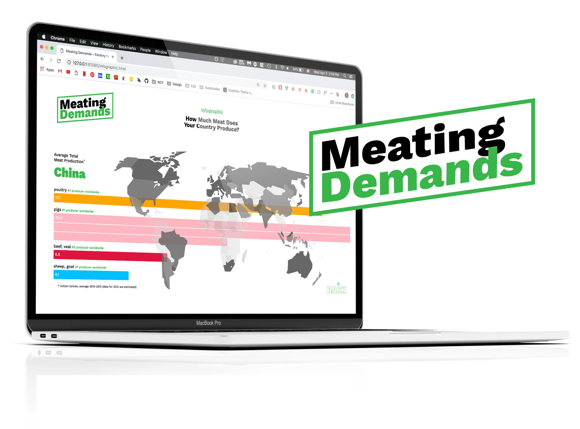
The interactive infographics, in a desktop environment
I began by gathering as much research as I could from a variety of different sources, about these different areas that are affected by industrial agriculture. While doing this research, I thought a good way of presenting the information would be in the form of interactive infographics, which are engaging and invite the user to explore, rather than simply actively receive information.
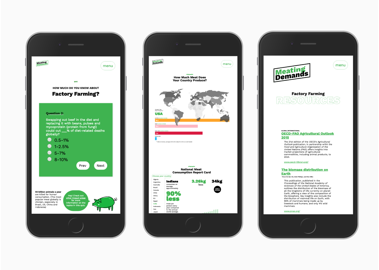
I narrowed down three different areas I had enough credible information to support: the annual meat production of countries worldwide, the amount of meat consumed yearly by country, and the total water used by different types of crops.
Because my research extended past these areas, I also added a quiz to the site as a supporting feature. The quiz can serve as an introduction to the subject in a friendly, non-threatening way, and is designed to engage and prime the user to the rest of the site's content.
Infographics also compliment the information by inviting the user to explore information about national meat production and consumption. The infographics were designed to be skimmed through and to make the underlying messages about issues of industrial meat product exporting more easily understood in an entertaining way.
The choices behind the colour scheme, the imagery, the layout and design of the site, as well as the content, were very deliberate. In working to dispel a stereotype of some animal rights advocates, the website's overall flavour was meant to be light, informative, positive and level-headed. The use of the green was meant to call back to the environmental aspect of the issue, and a playful, modern look was meant to appeal to users who would not otherwise seek out information about factory farming.
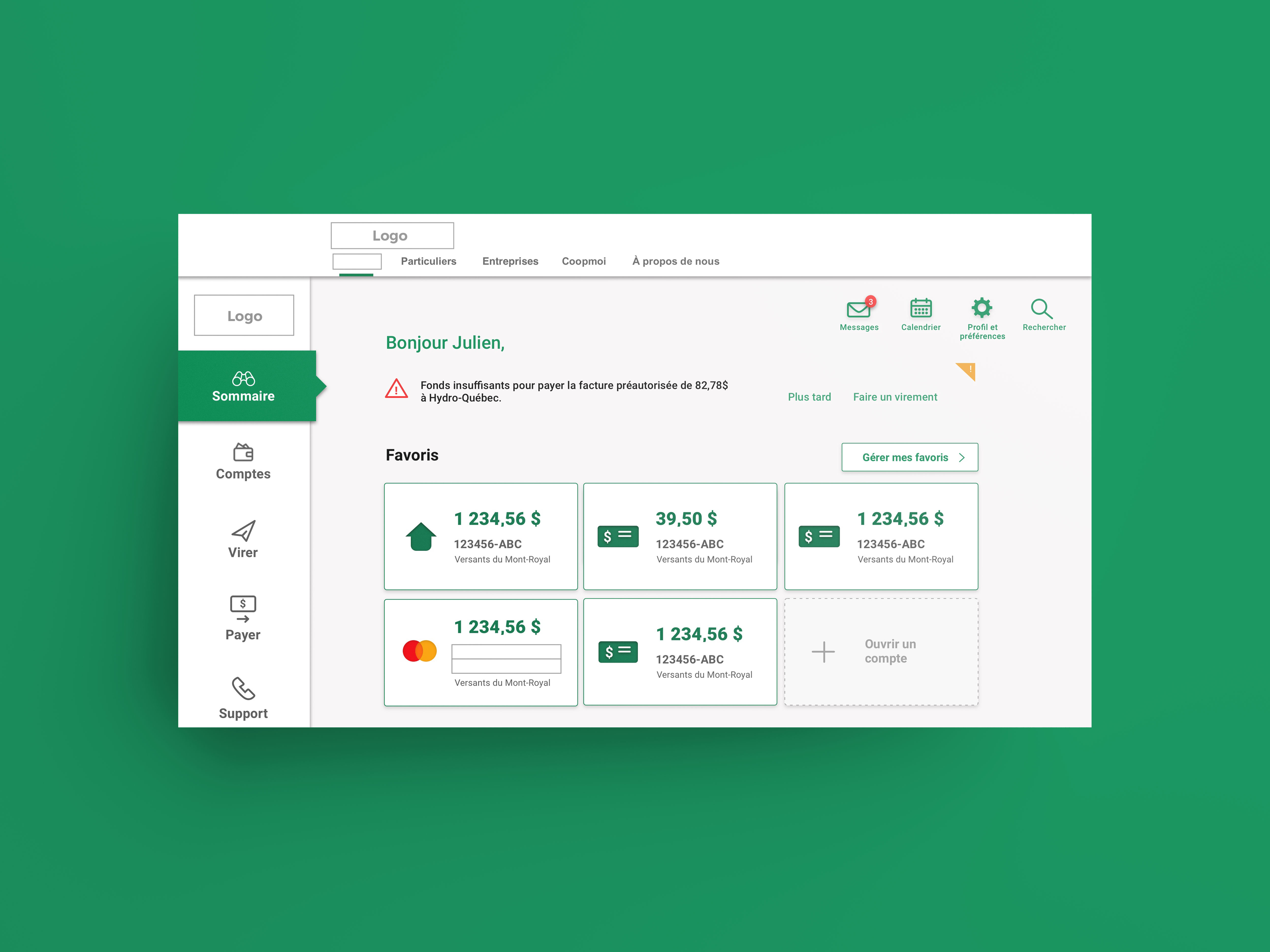
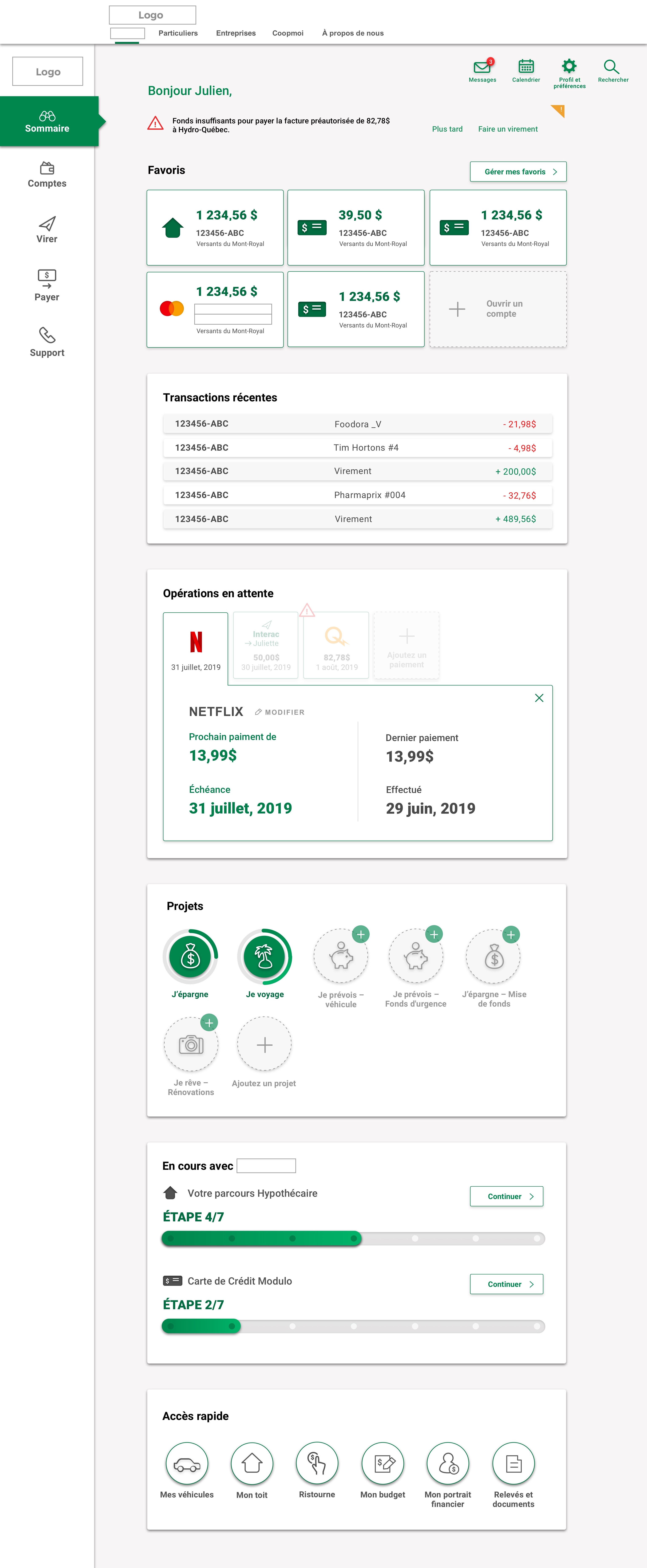
Interactive user interface design of prototypes to test and validate user's experience of new features on a desktop and mobile banking application.
(Please note: logos and defining brand elements identifying project's client have been deliberately removed.)
Date: August 2019
Client: Deloitte Digital Canada
Role: UI design
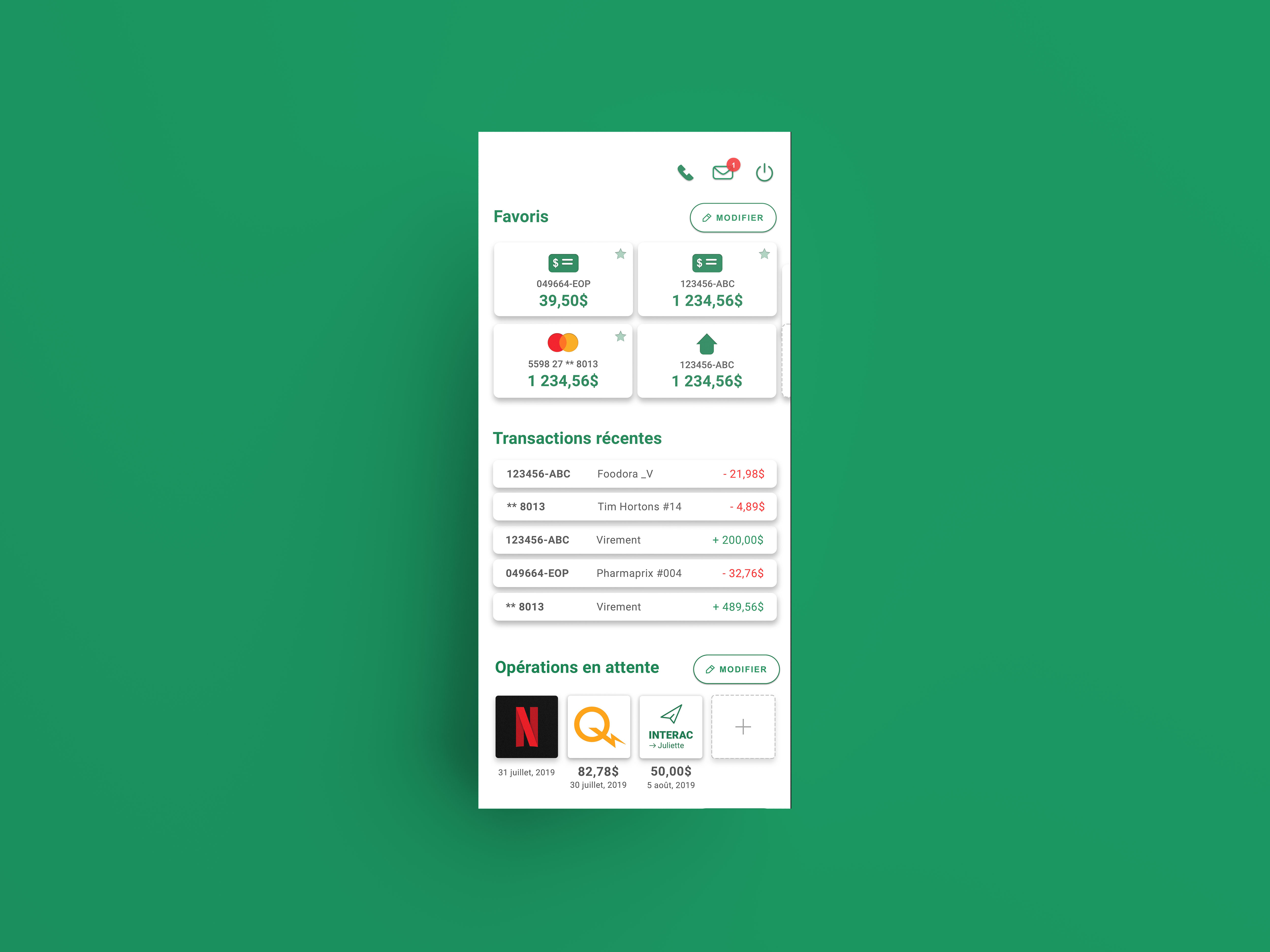
Mockup of desktop app
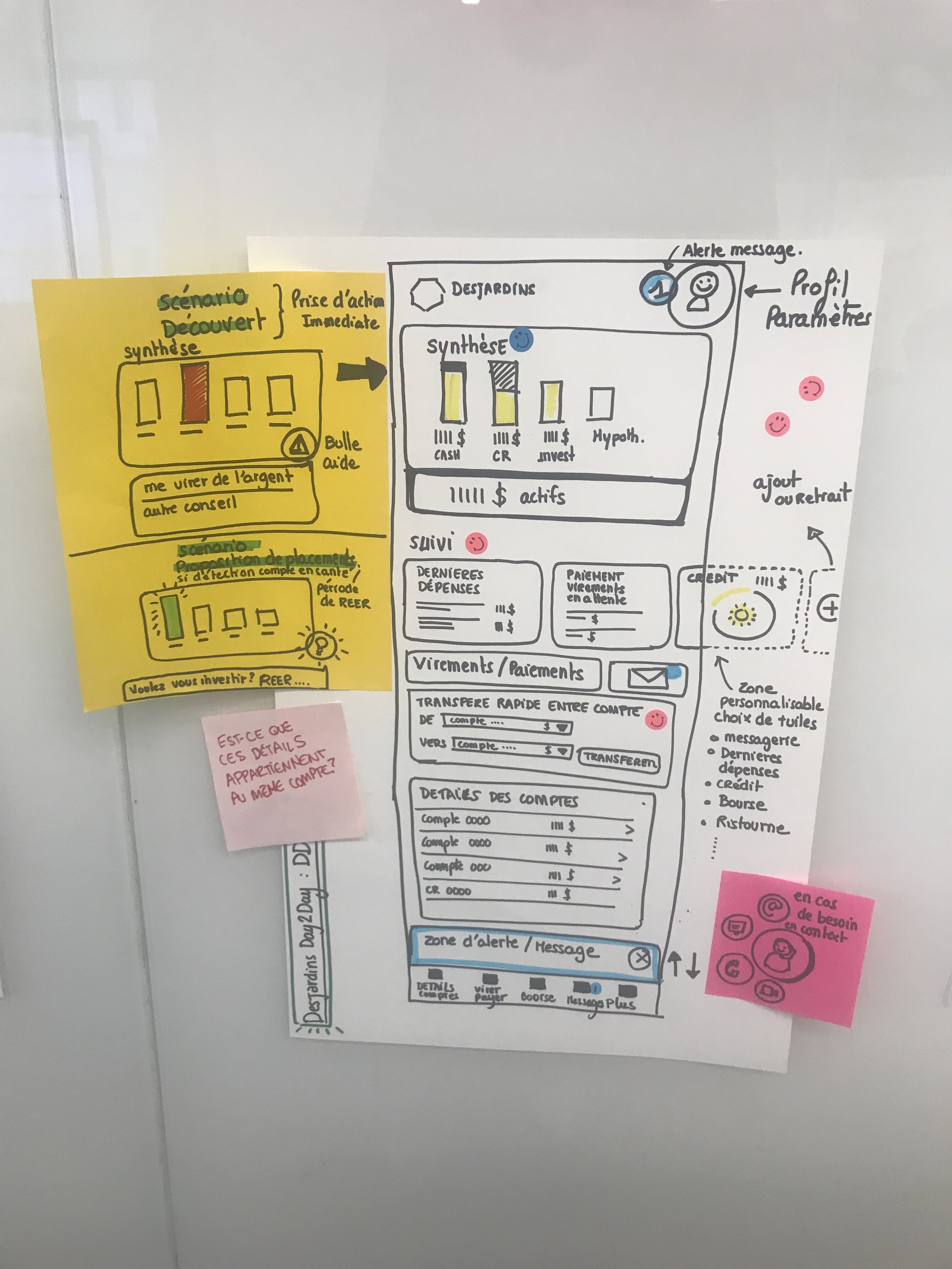
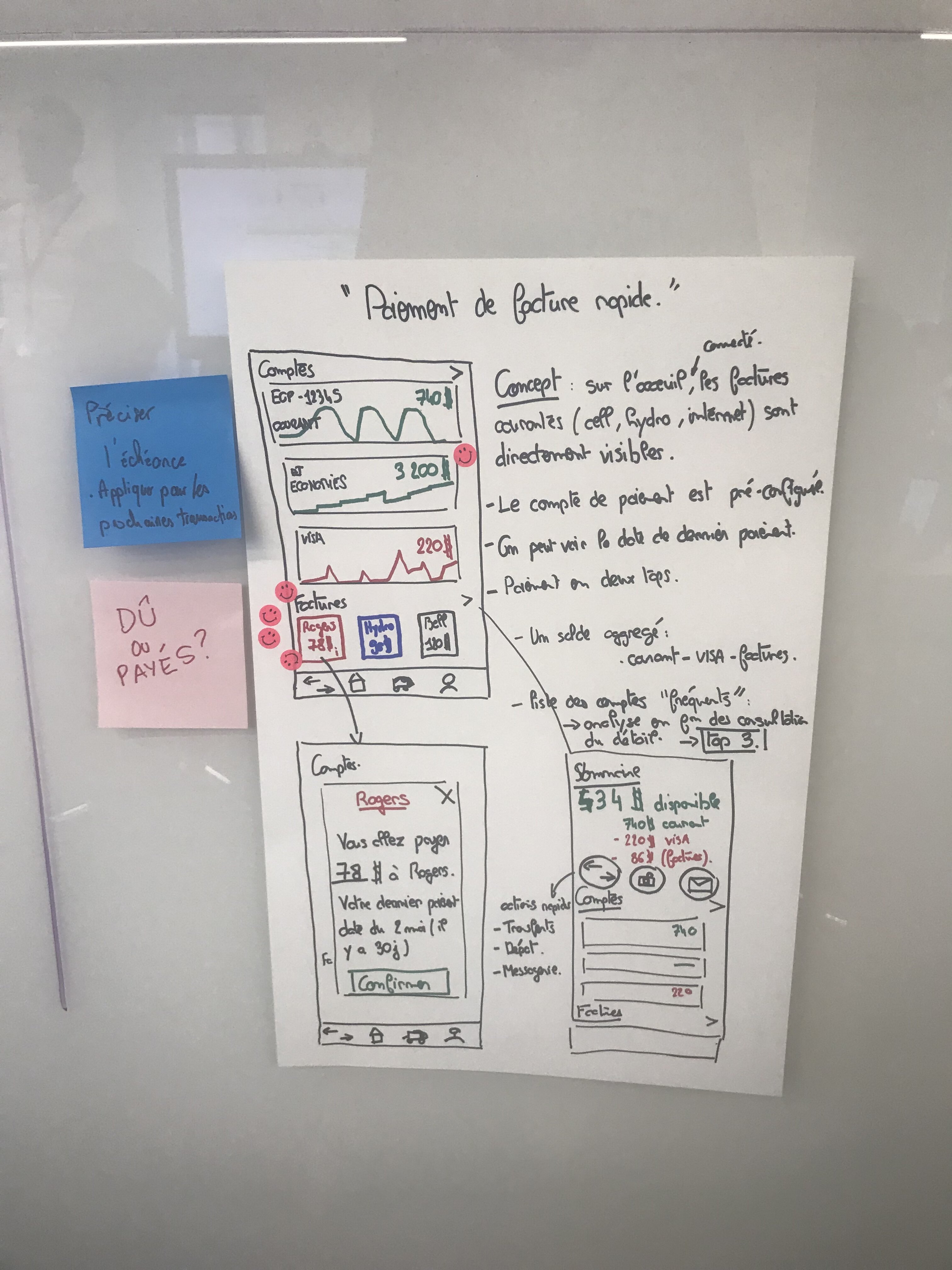
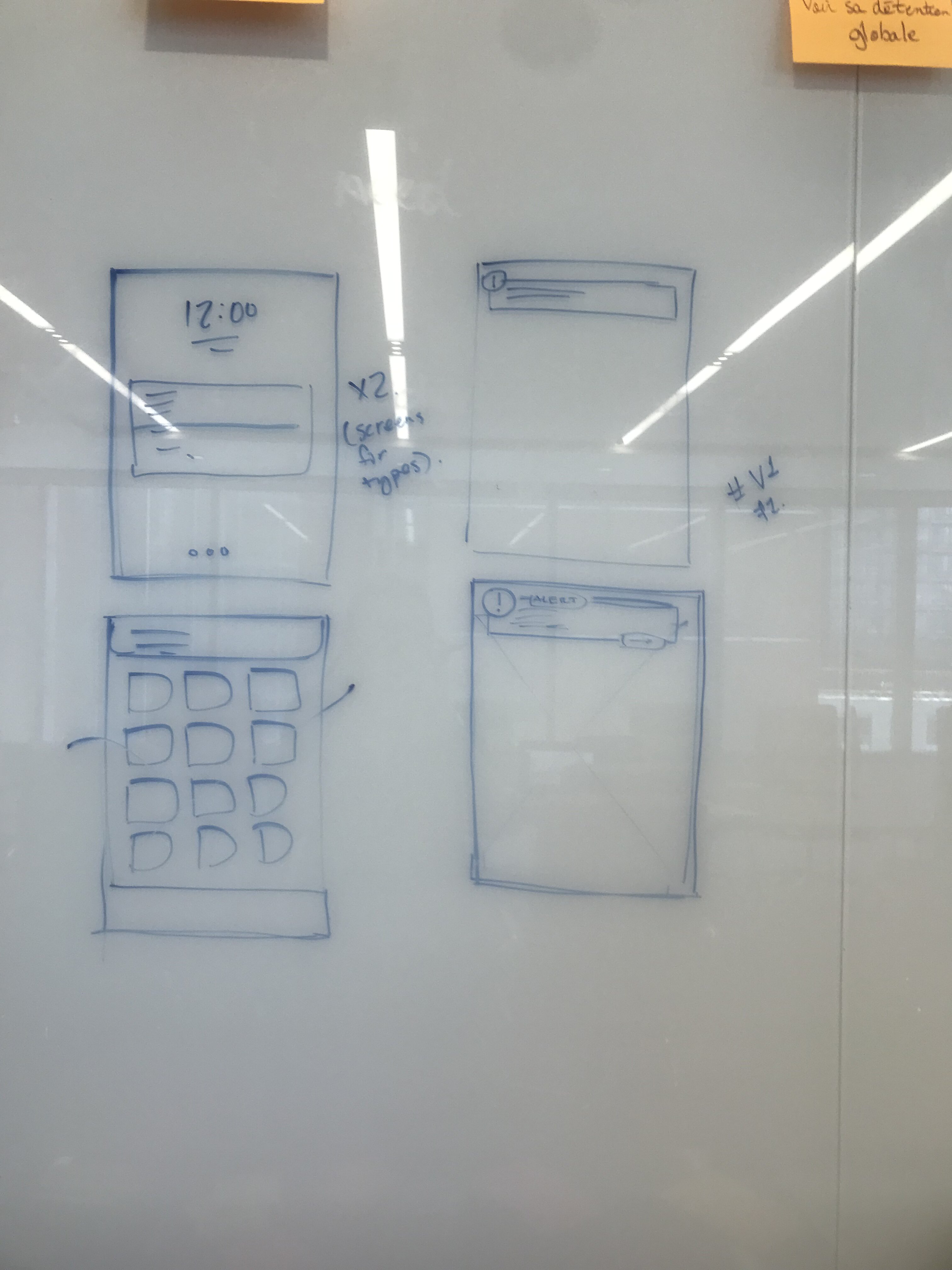
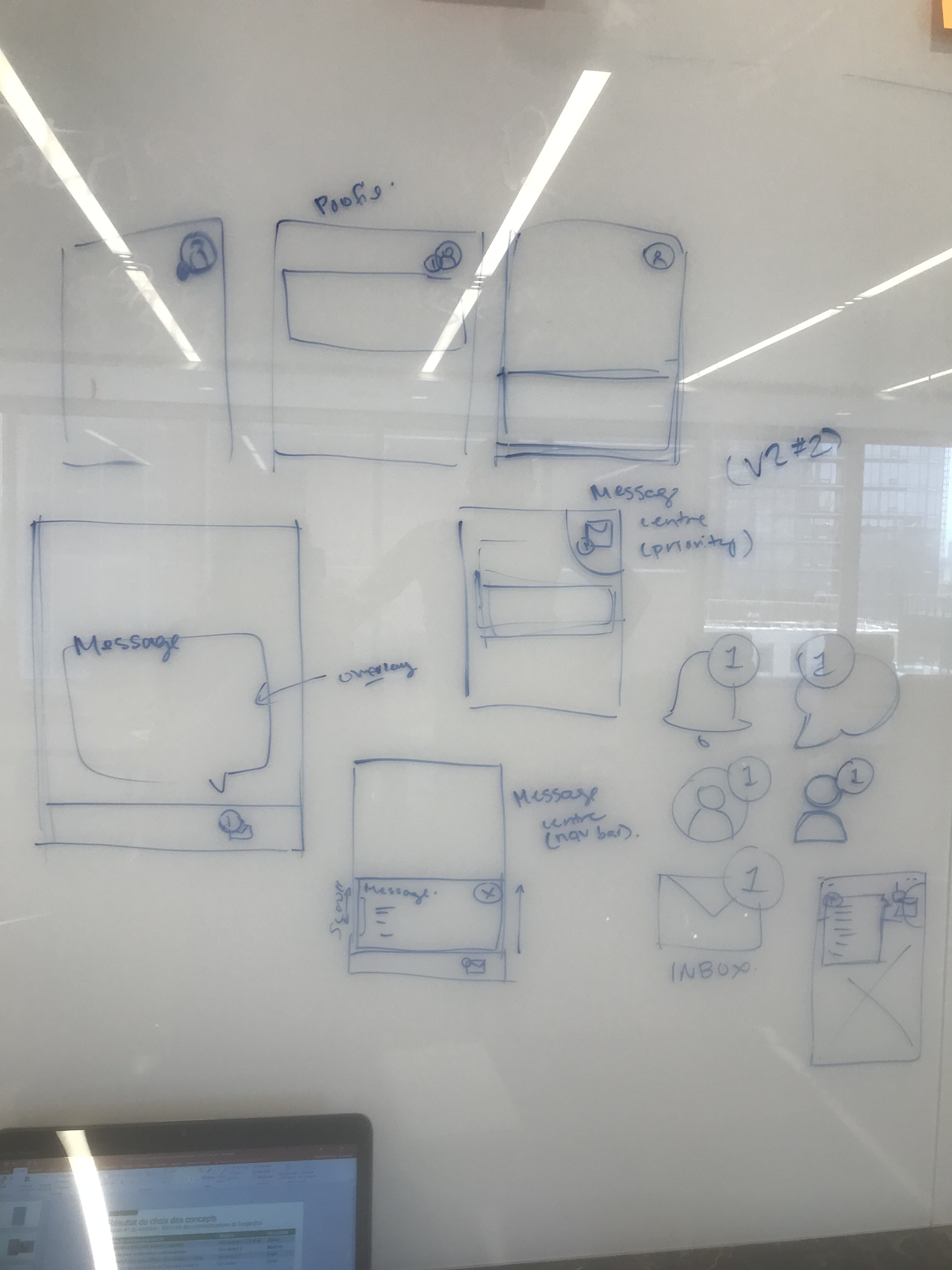
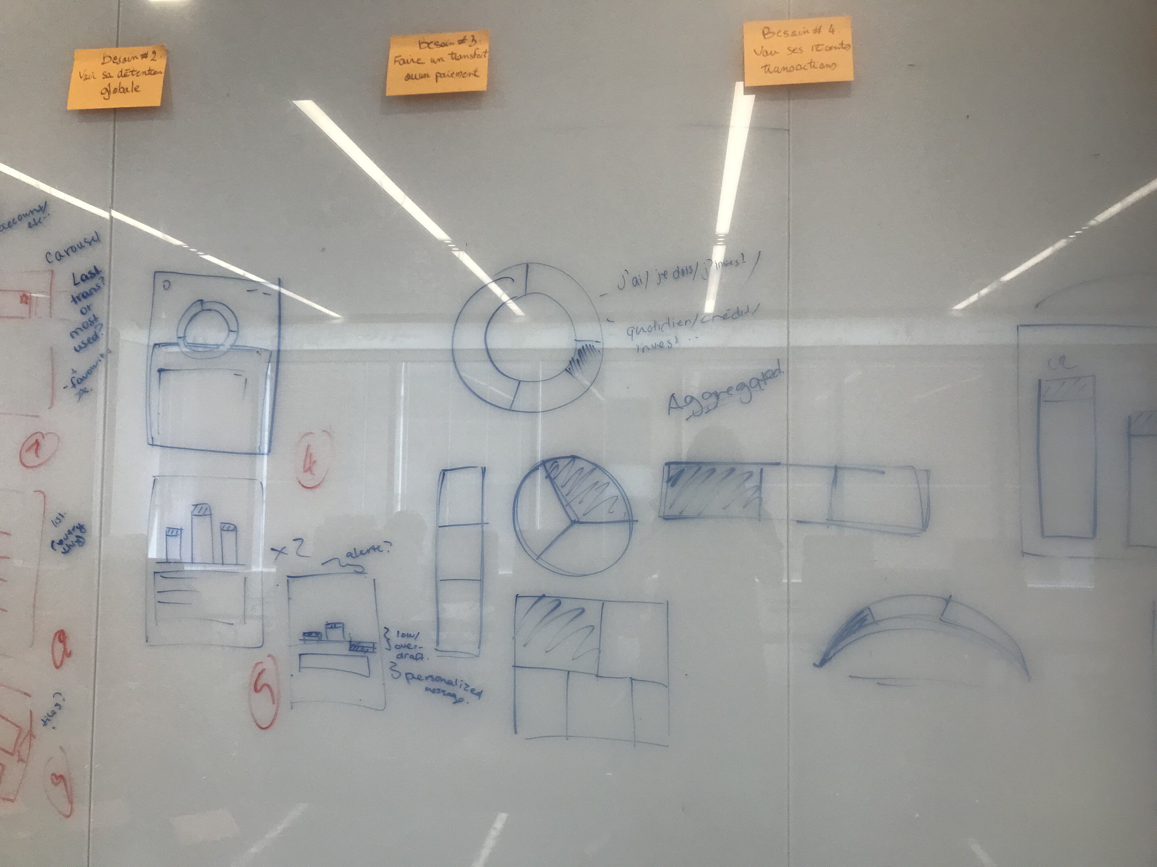
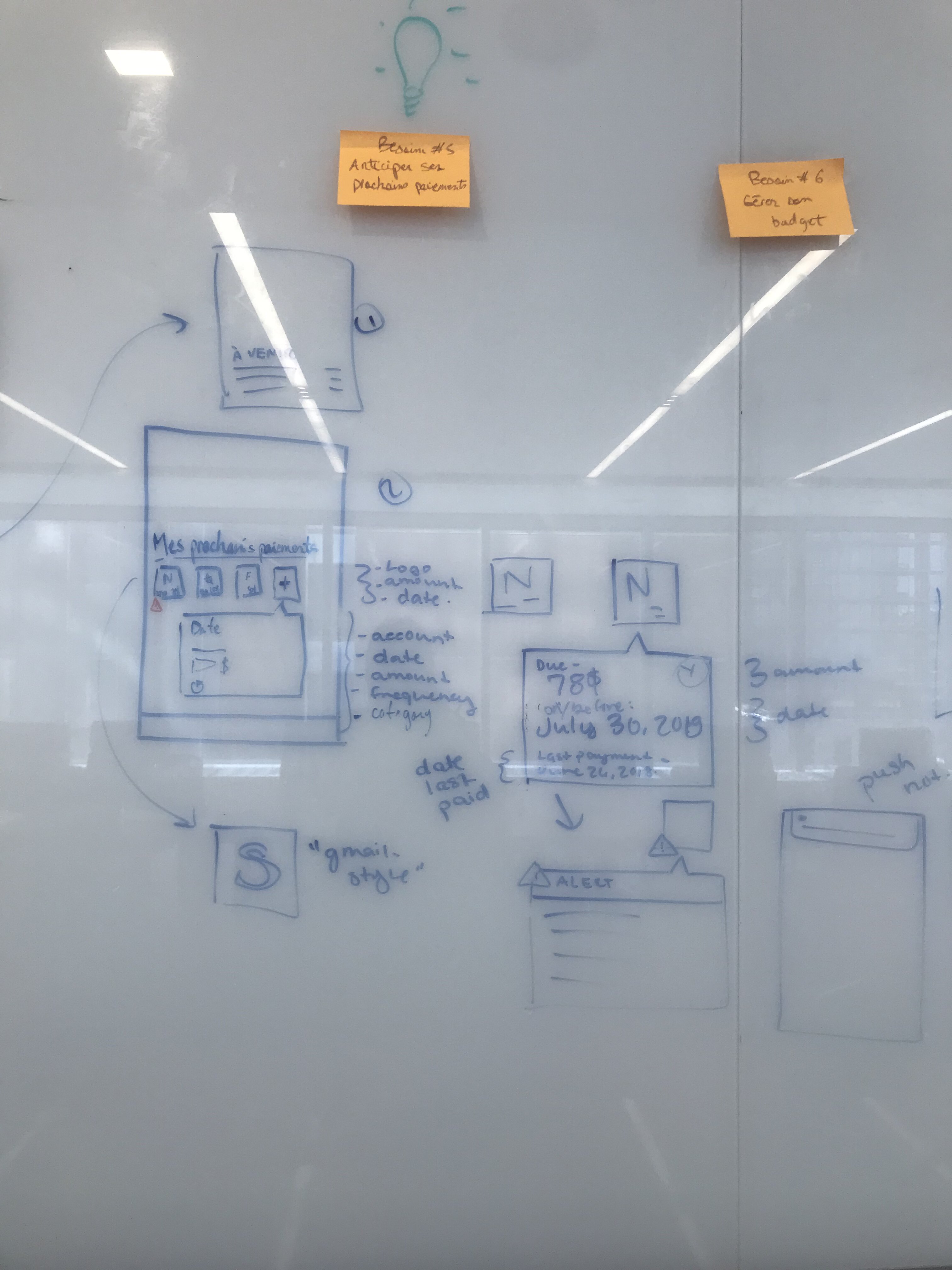
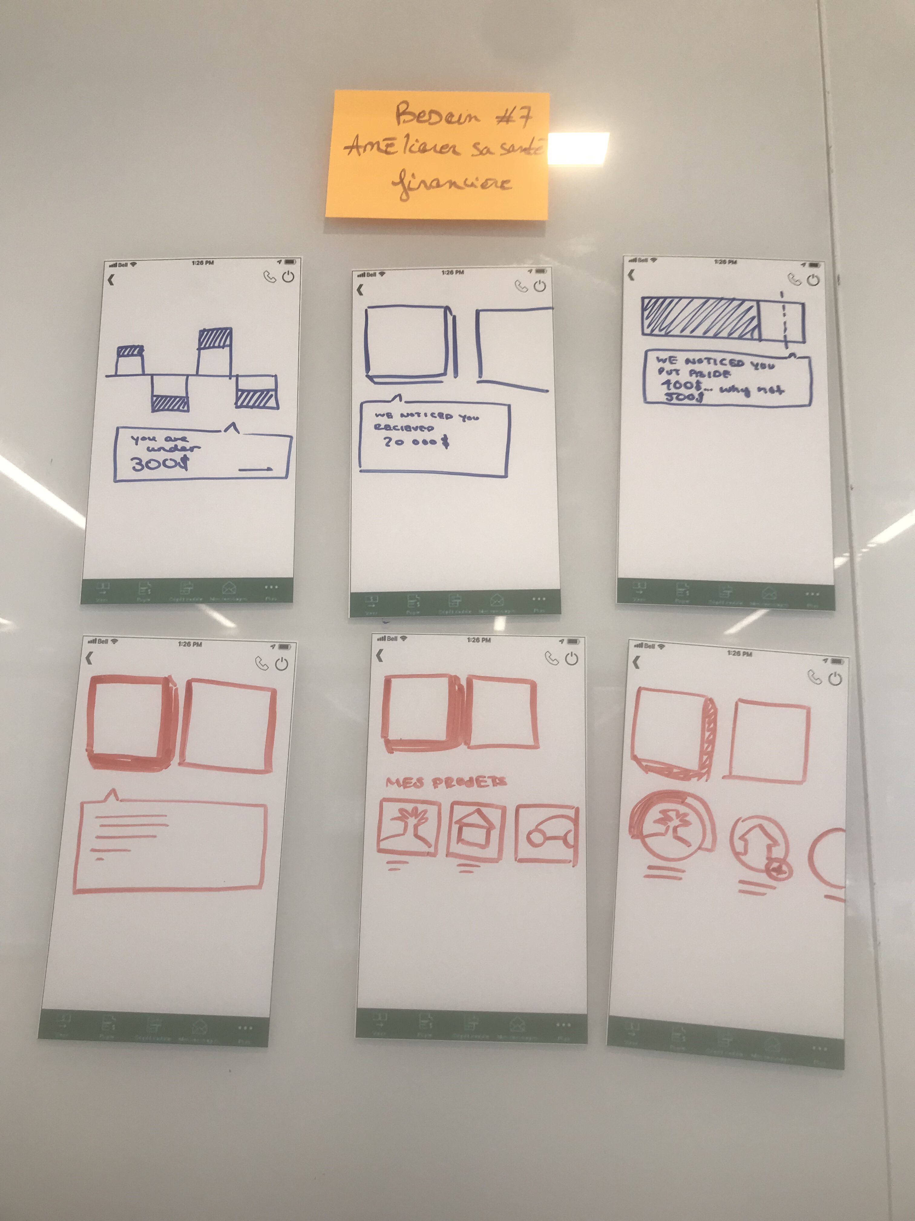
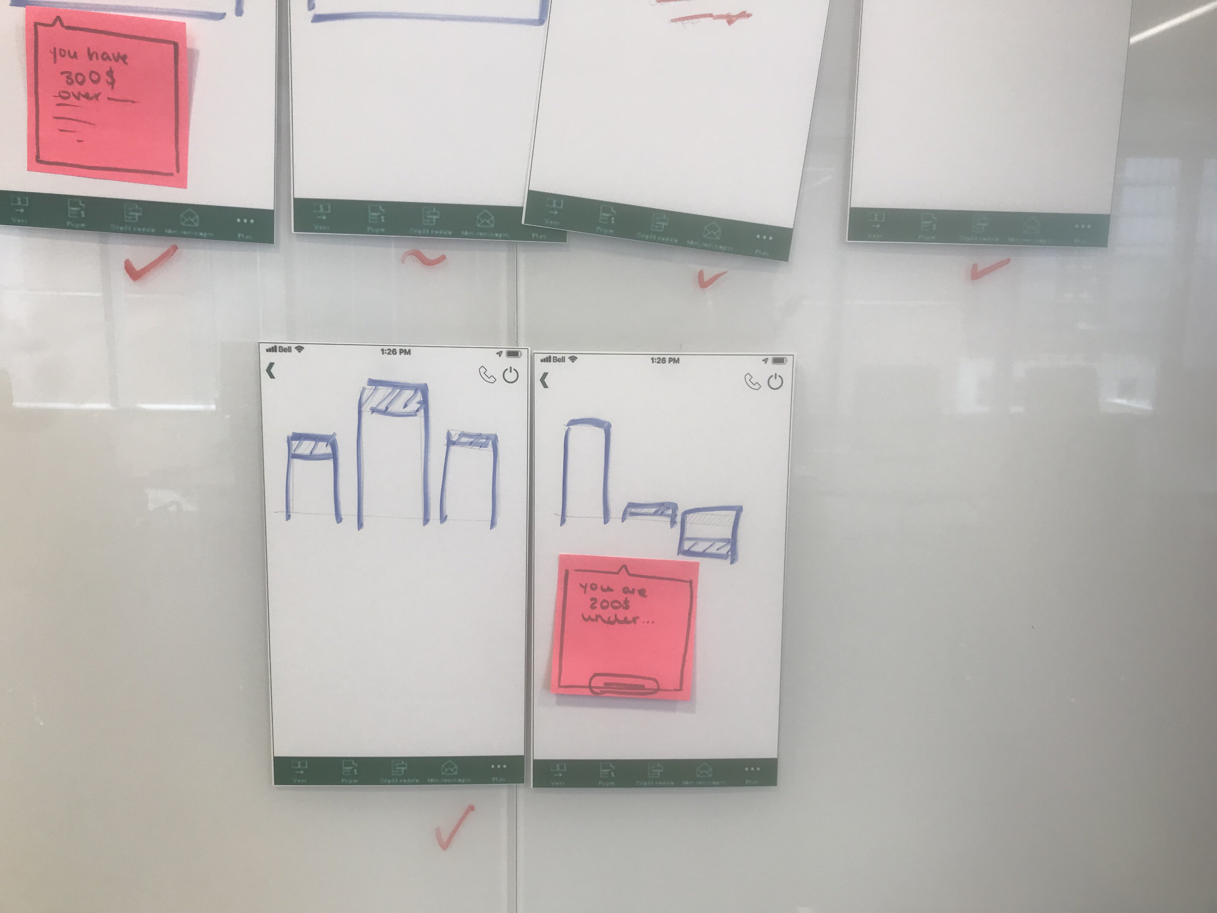
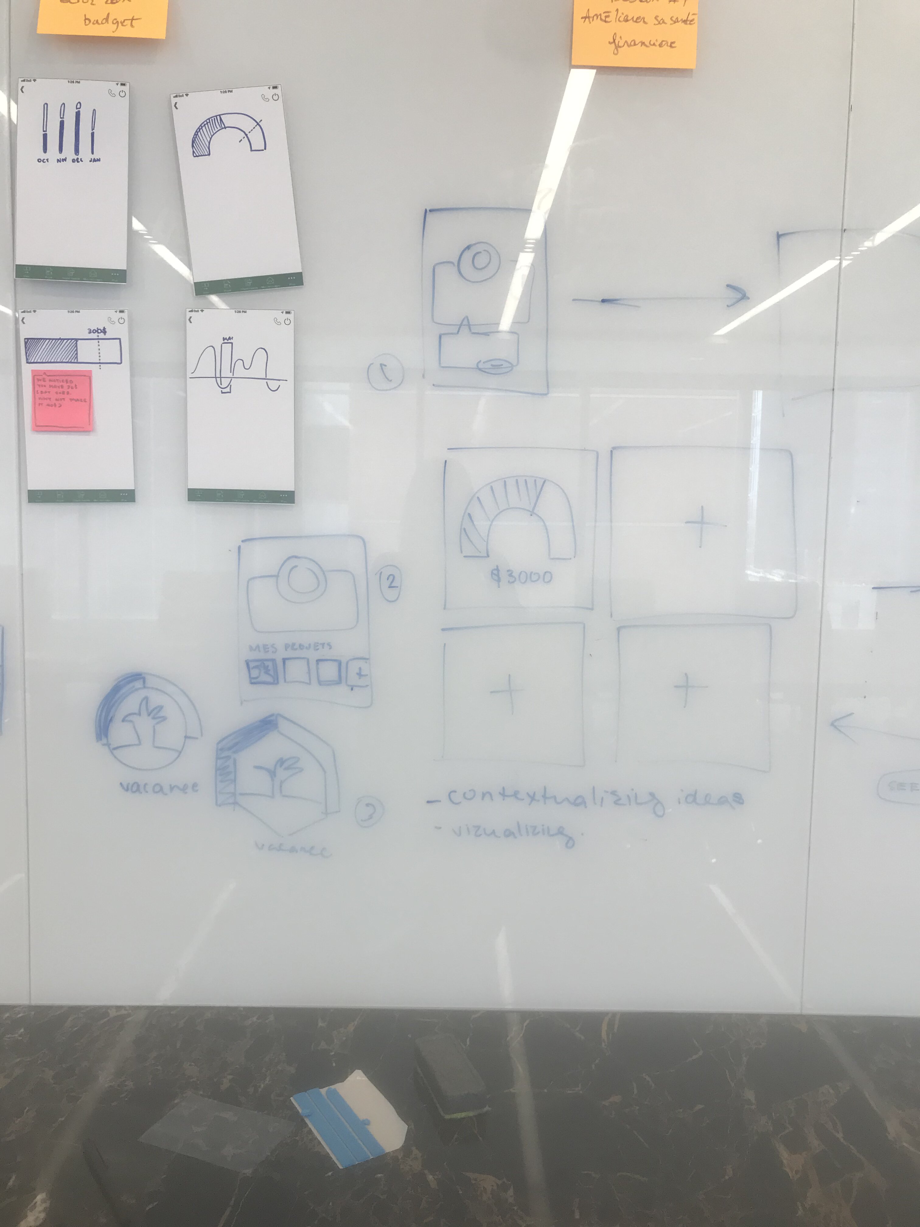
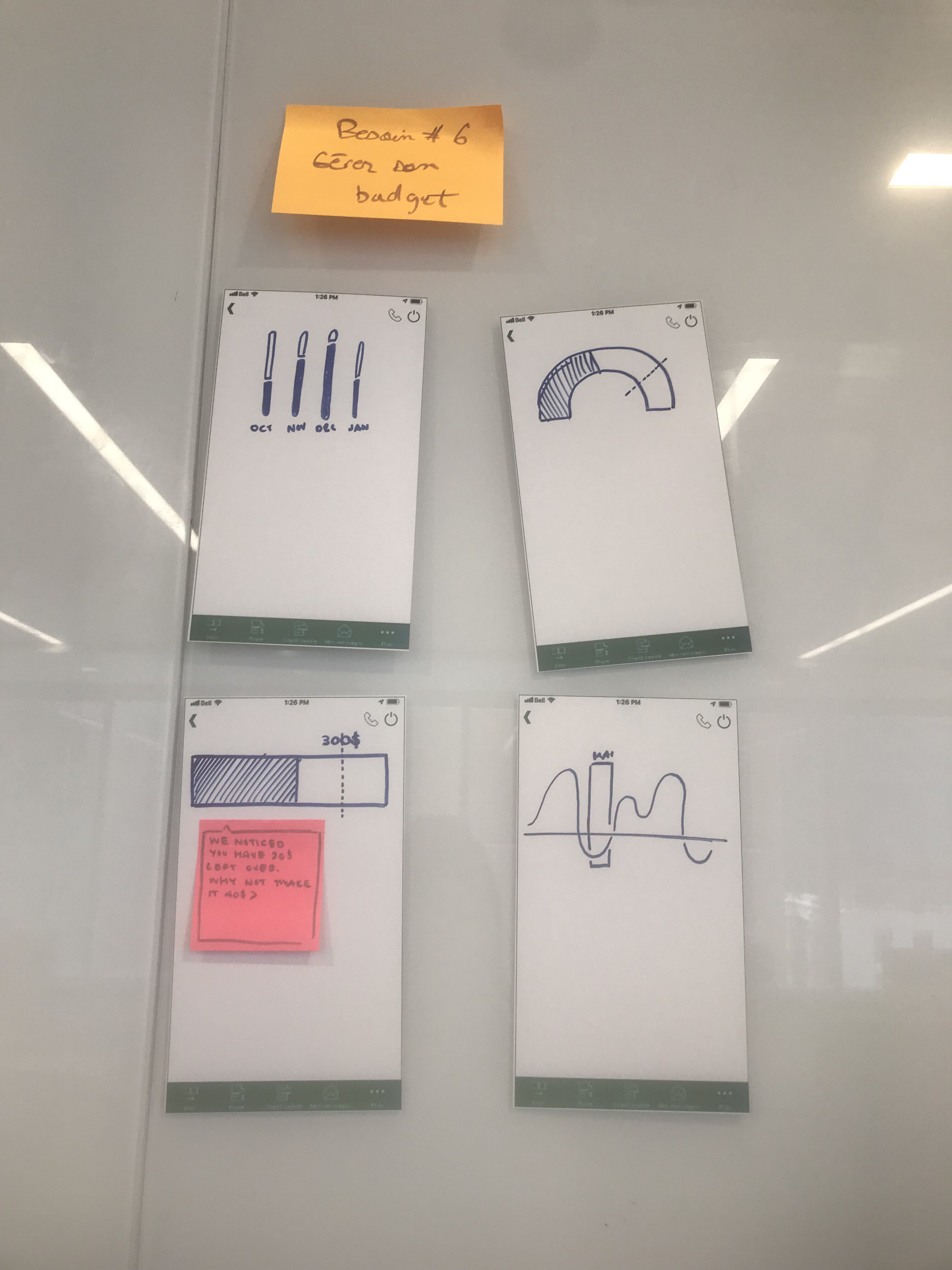
Examples of the ideas for app features produced during the sprint
In the summer of 2019, I was hired as an interface designer by Deloitte Digital, to assist them on a project to create a set of recommendations for a client's mobile banking application. The project began with a brainstorming session at Deloitte's Greenhouse. Employees of the client were invited to participate in a design sprint to identify key areas of their banking application that were well-liked and used by their users, and areas where services could be changed or more effectively emphasized.
During the brainstorming session, participants were asked to rapid prototype potential interfaces with the features they considered most valuable. Once the lo-fi prototypes were done, everyone then voted on their preferred individual features that were explored in their colleague's prototypes.
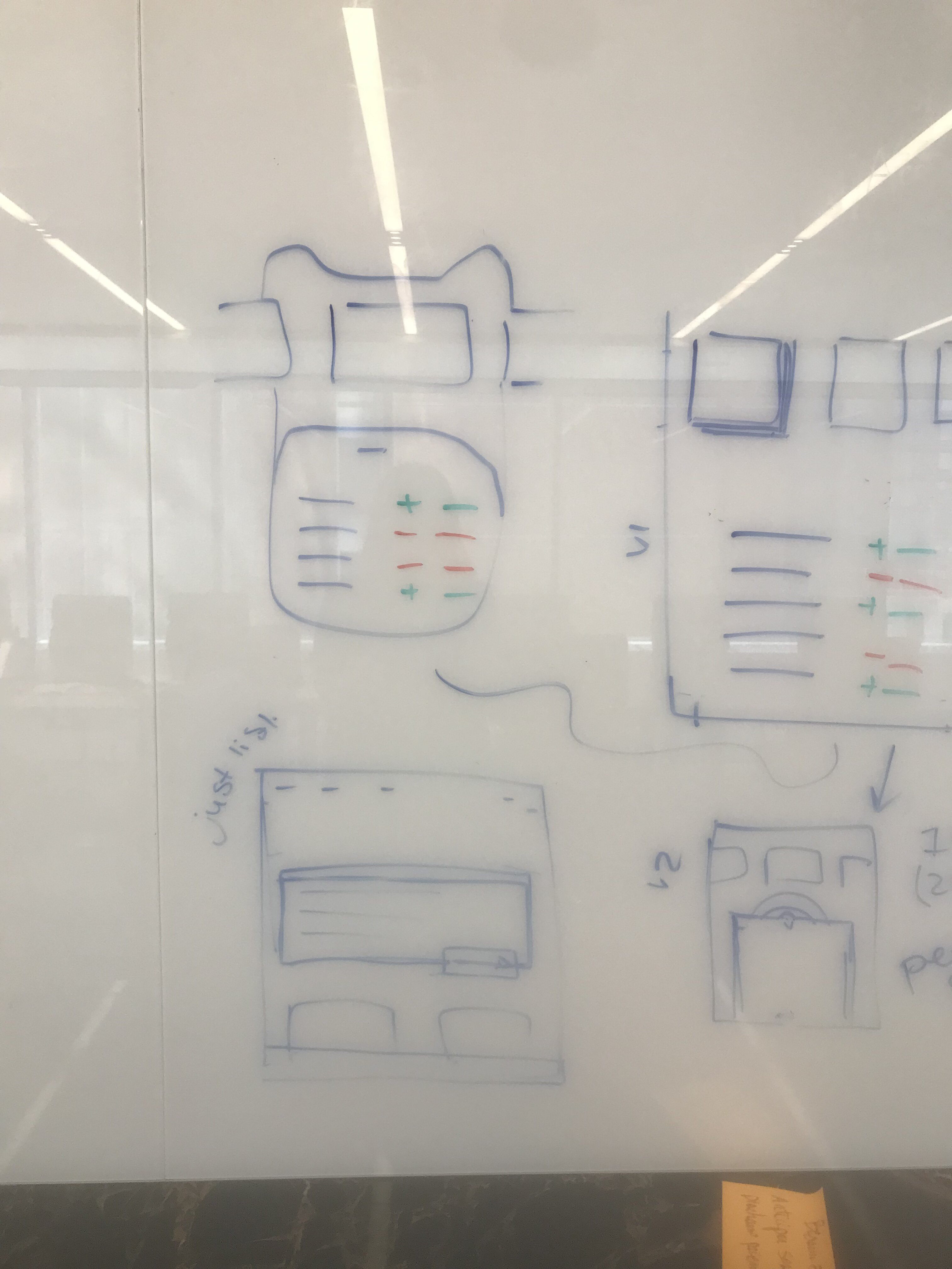
Brainstorming possible alternatives for different desired features, such as tracking your savings goals, seeing your upcoming recurring payments, etc...
From here, the team I was working with reconvened to reflect on the findings from the session, and so brainstorm on possible interface options for each of the features. These interface elements would then be tested with the firm's clients.
Concepts of features
The result of this session was a list of priority features to test with users, using medium-fidelity prototypes of mockup interfaces, to receive feedback and reactions. After the testing revealed the desireability and viability of certain features, our final recommendations were shared with the client. The features that were included in the mobile application were translated to a desktop application.
Homepage of the desktop app
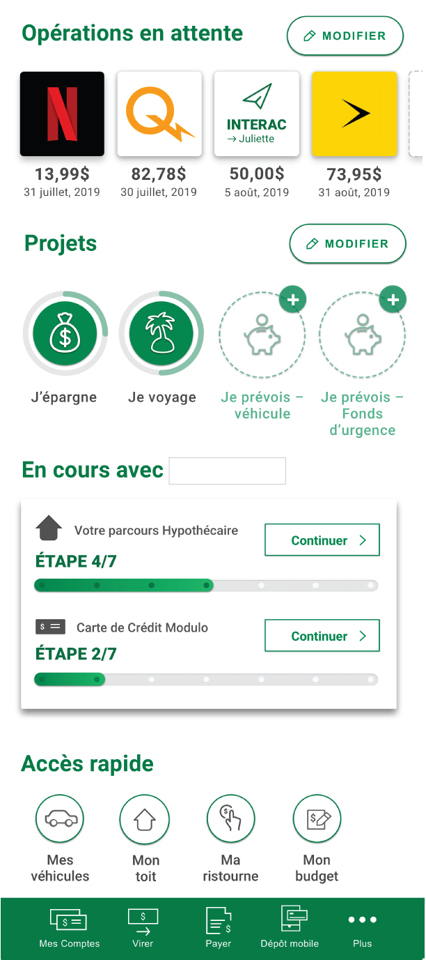
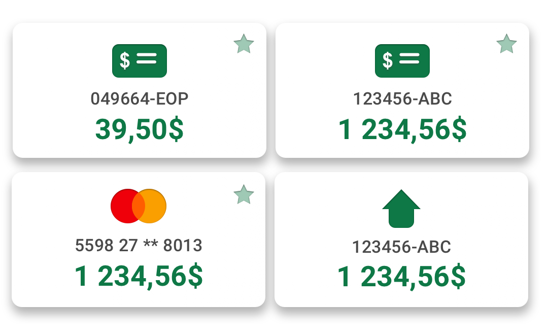
Close-up of the pending transactions feature
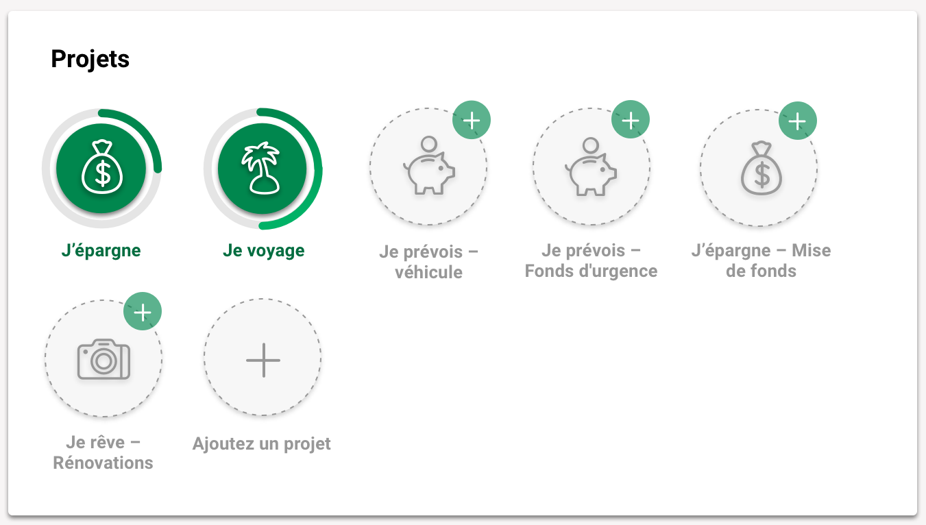
Close-up of the projects feature: visual
The brainstorming sessions revealed a need for the user to have a visual indication of the progress of their project goals at a glance. Within this section, users are also able to add other projects to this section.
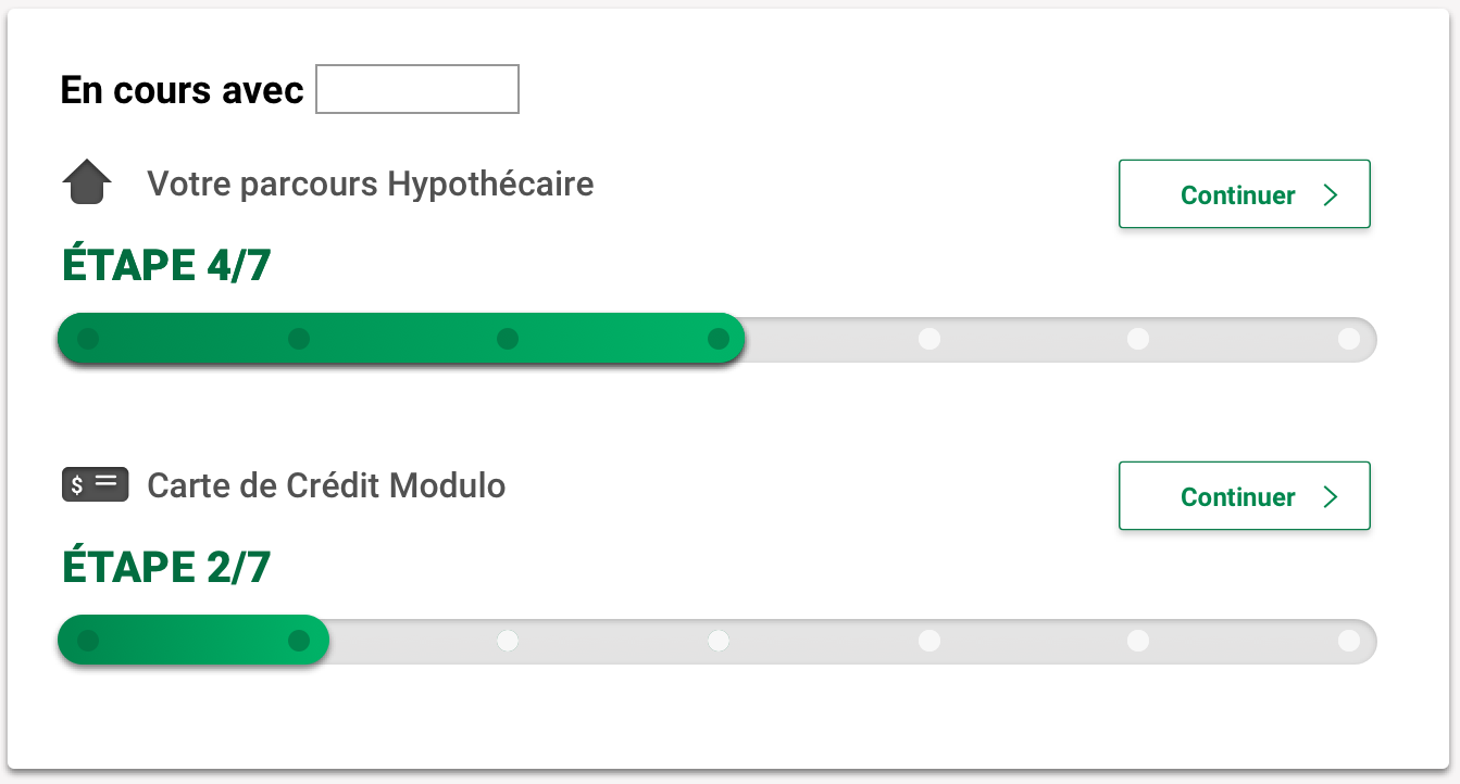
Close-up of the progress section
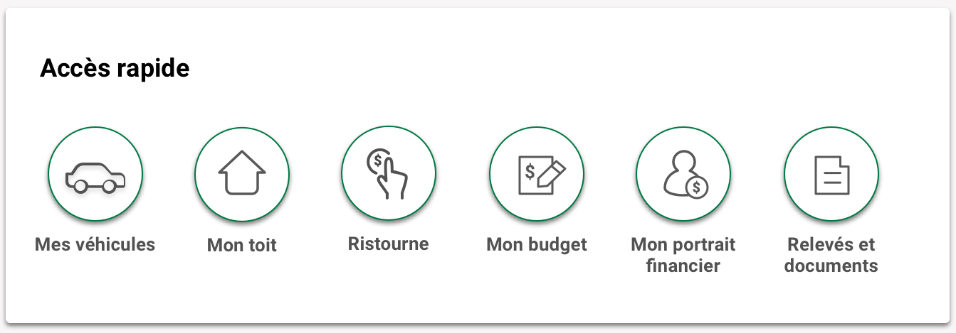
Close-up of the rapid access menu
A challenge of this project was to introduce new elements where users were accustomed to a particular information architecture. In order to maintain enough continuity with the original layout of pages, while also optimizing space and making the menu more visually appealing, icons were introduced to illustrate menu items.
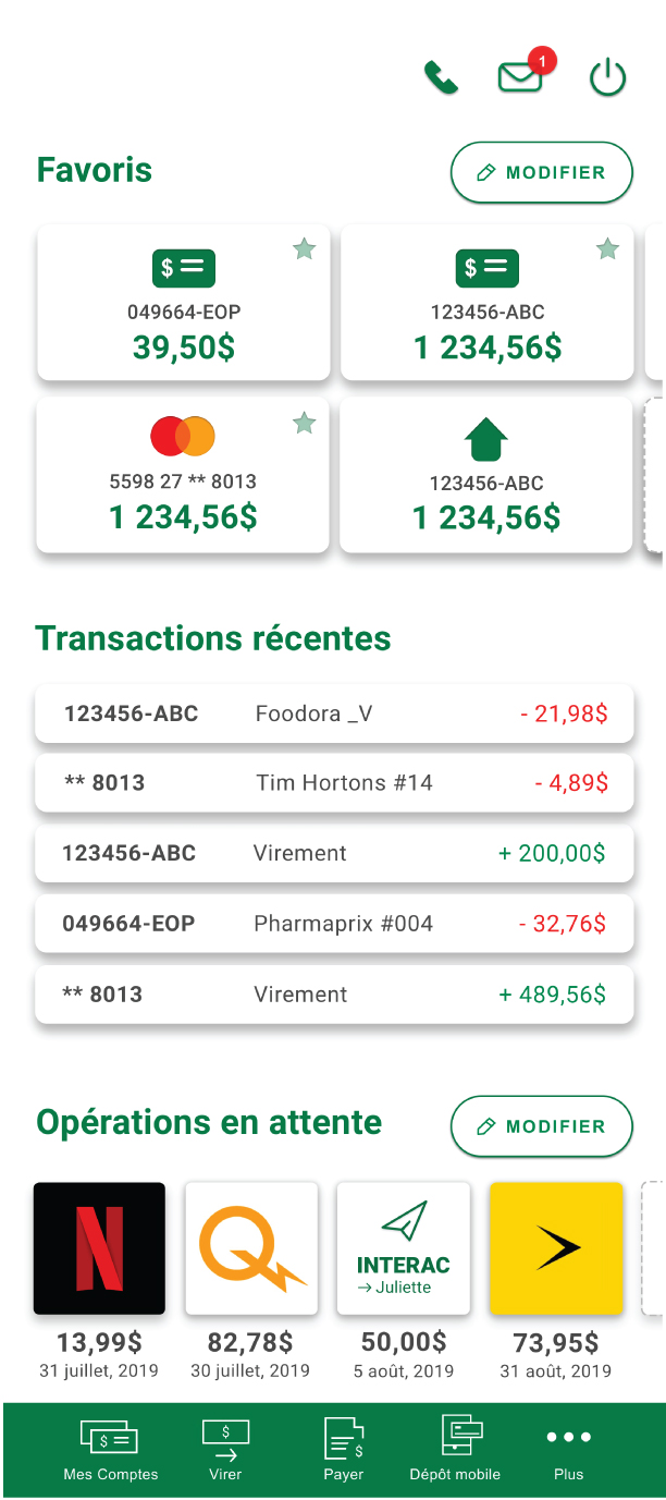
Preview of mobile screens
Details of menu items and accounts menu
This website was a product of my own desire to continue my research into the ethical limitations of human-computer interfaces, and to address the growing rise in the awareness of the relationship between screentime usage and mobile devices.
Date: December 2019
Client: Personal project
Role: UI design, web design, graphic design, content creation
URL: aadmanifesto.com
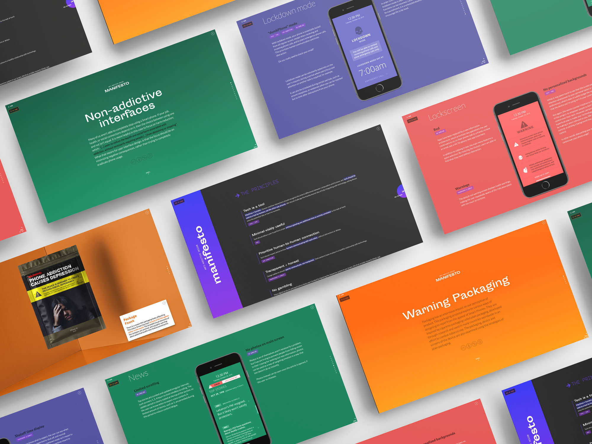
We live in a world saturated by screens. As someone who works to design products and spaces online, I was interested in exploring more in-depth impact on the places we interact with nearly constantly. This research-creation piece is a culmination of my research into habit-forming products, dark patterns, user psychology, human-computer interaction, and harm-reduction in addiction treatment.
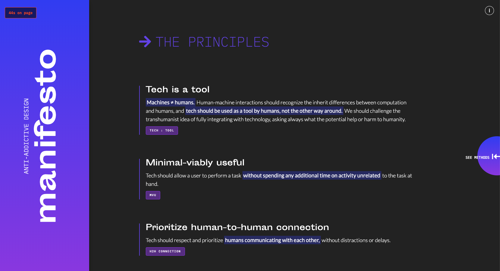
The Principles are the foundation of the manifesto
The website outlines the resulting guidelines I identified from my research, which are higher-level concepts that designers can use if they are concerned about the impact their work can have on people who use their products. Some include: machines and humans are fundamentally different, technology should allow users to complete a task without distractions, it should prioritize human-to-human connection, it should be honest and not take advantage of humans' innate psychological tendencies.
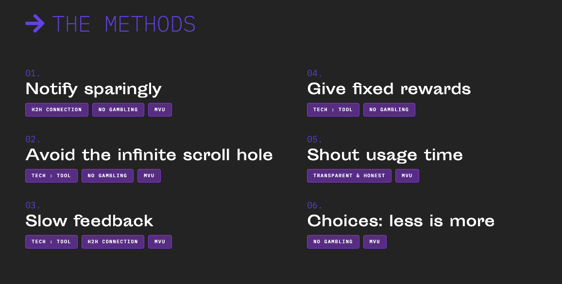
The Methods page: tags underneath point back to Principles outlined earlier
From there, I set out a series of methods to achieve these goals, in a more practical sense, such as avoiding an infinite scroll, not using invariable rewards to hook users, and to curate a selection of meaningful choices. Each method expands into a small description of the impact and reasoning behind it.
Left: The timer in the corner of the page is fixed, and lets the user know how long they have been on the page
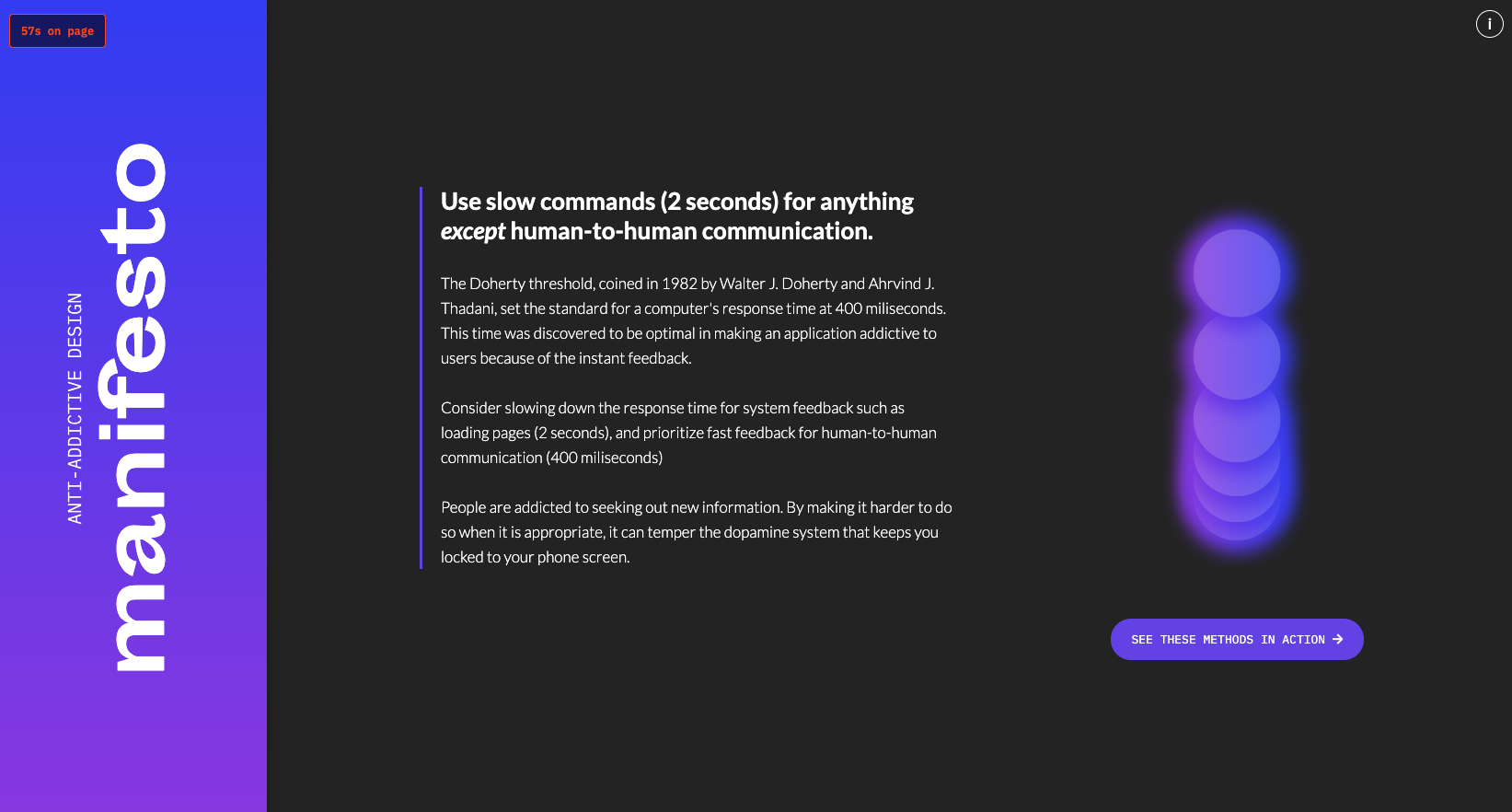
Expanded methods page
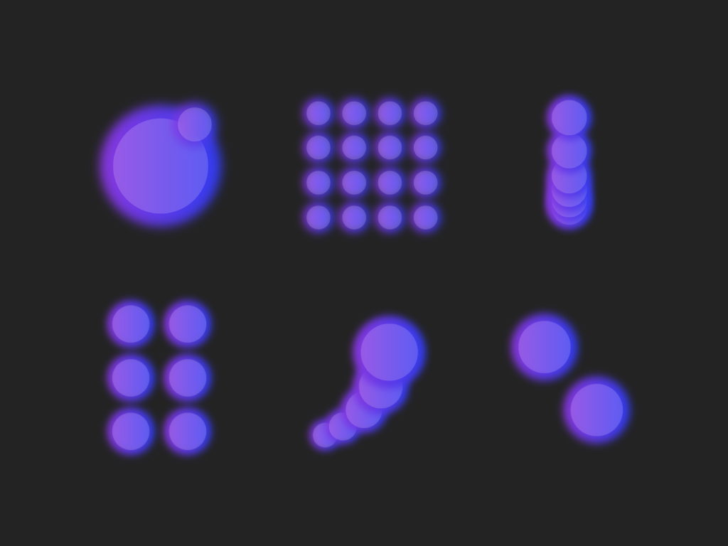
The illustrations used to compliment the anti-addictive design methods
In order to keep with a unified aesthetic, I created a series of illustrations that reinforced the theme of the text. I decided on abstract forms as to allow for the reader to consider its application across multiple avenues.
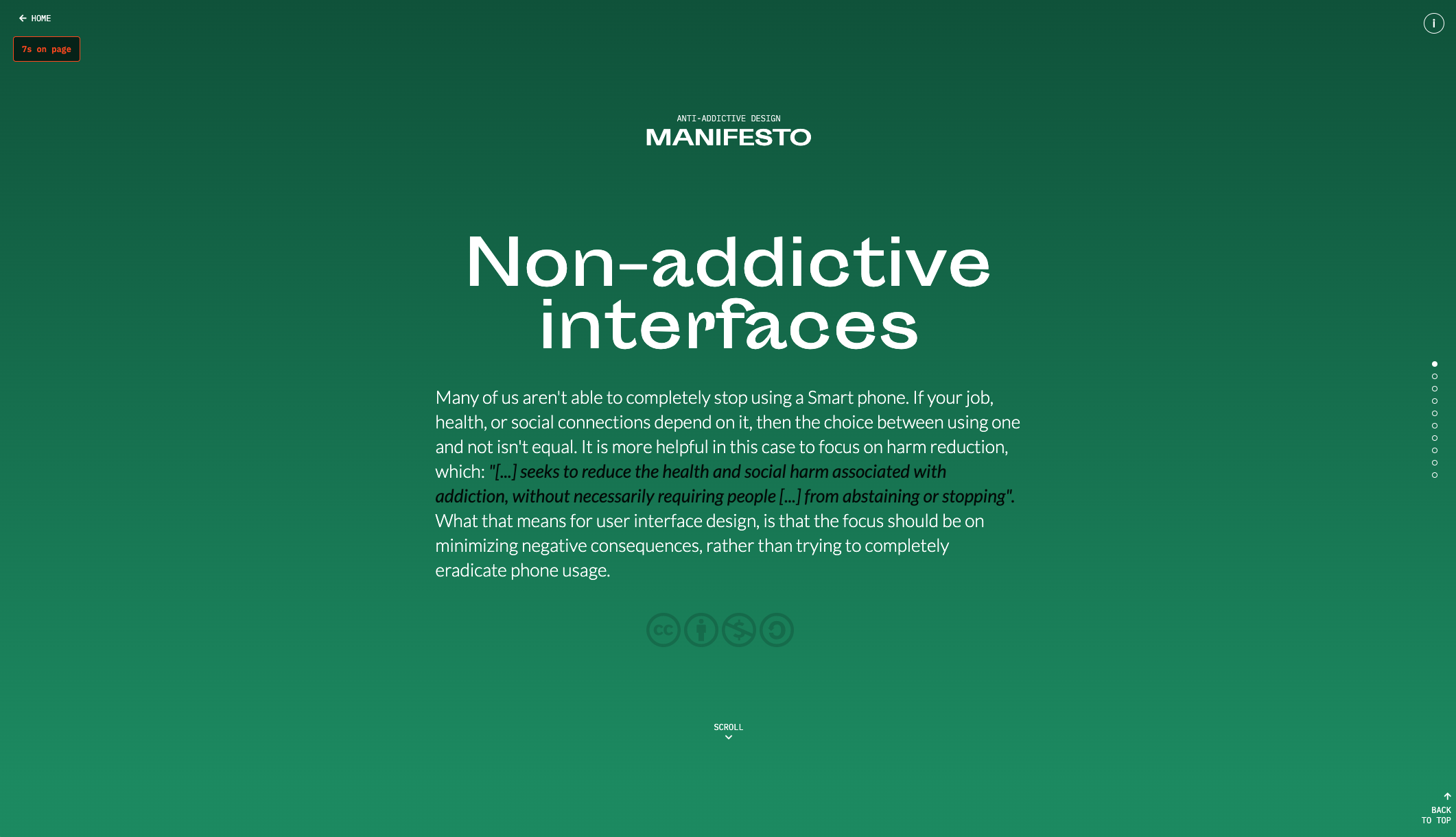
The next section of the website was a further elaboration of the Methods section. I wanted to take the concepts outlined there and show a pragmatic application of them. The Interfaces section is my attempt at a design system for a mobile operating system that is designed with the manifesto at its core.
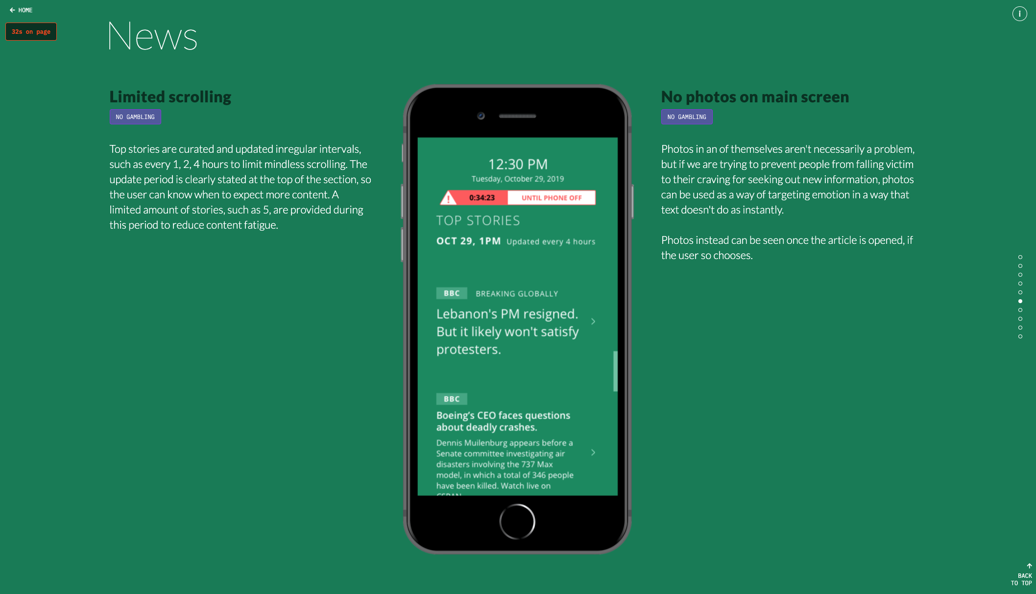
The news section suggests a limited feed of content, instead of infinite scrolling
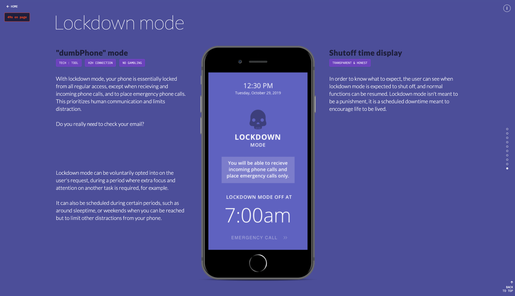
The proposed hypothetical "lockdown" mode works similarly to iOS' screentime lock, except that the user is unable to use their phone at all except as a way to contact emergency services
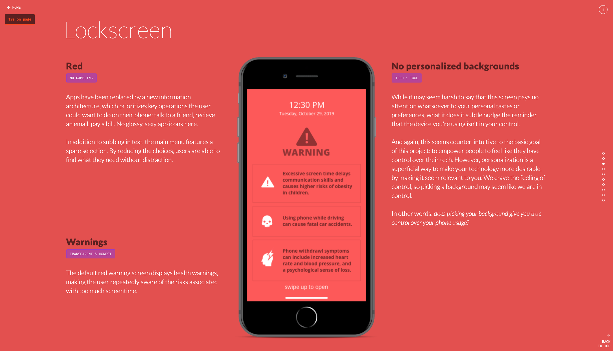
The lockscreen features warnings about the effects of excessive screentime
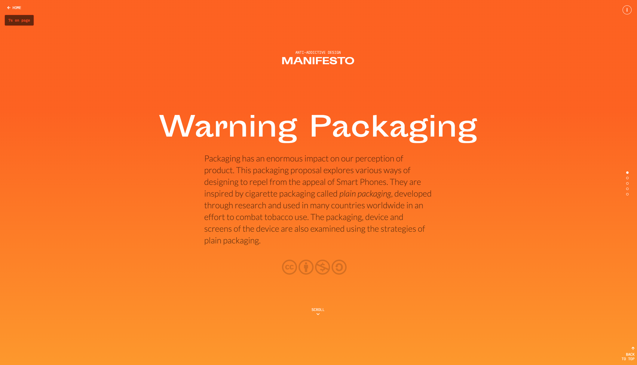
Because interfaces weren't enough, I decided to continue my research to explore the non-digital aspect of product: their packaging. For this, I focused my research upon cigarette packging design, an area where intense government regulation and research has been spent to influence brand perception. To speculate on what it would be like to live in a world where smartphones were considered dangerous, like tobacco products are now, I created mockups to explore how packaging could look.
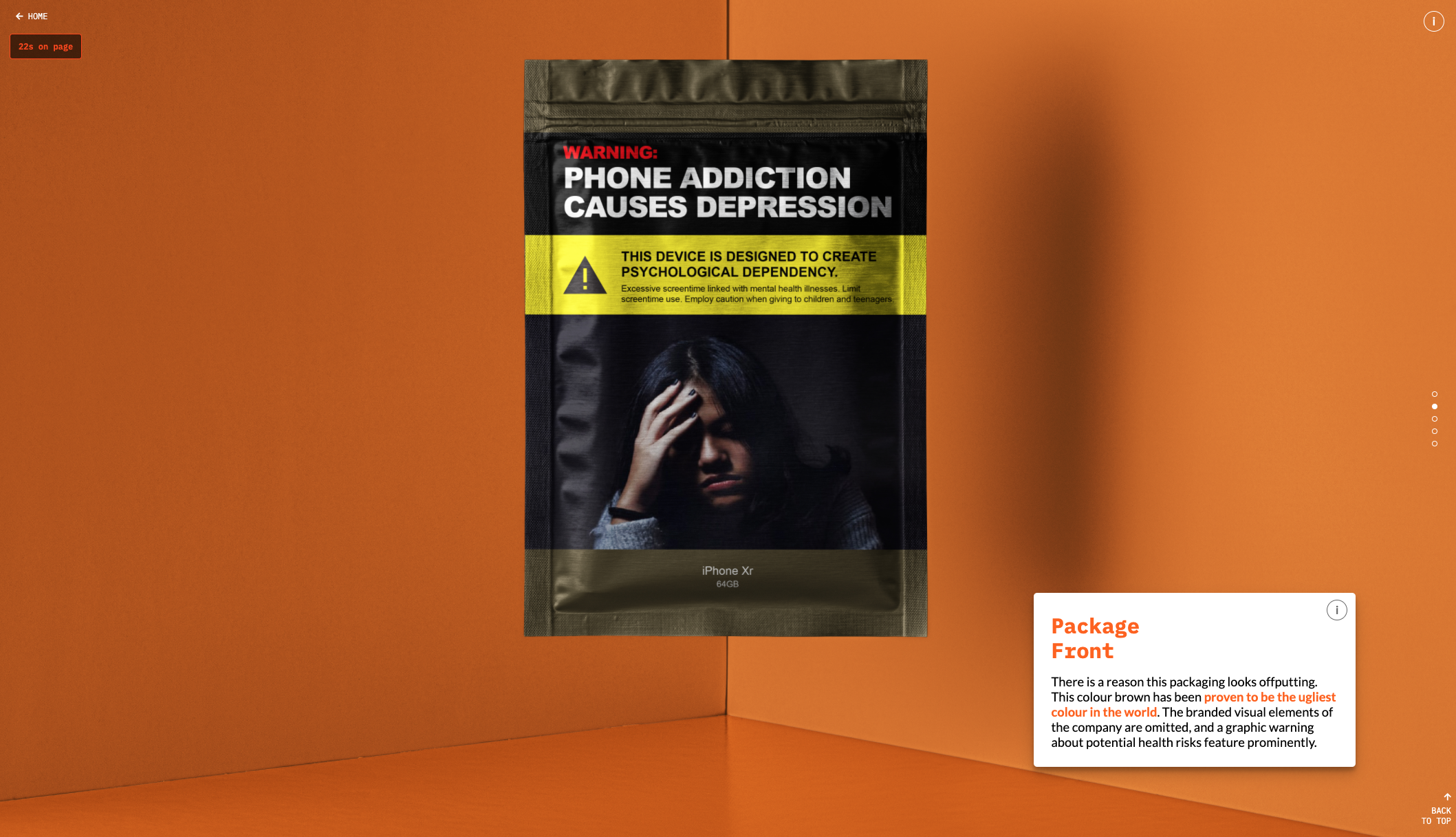
A mockup of the package – the design is inspired by plain packaging used in cigarette packaging in Canada and a variety of countries to deter users from consuming
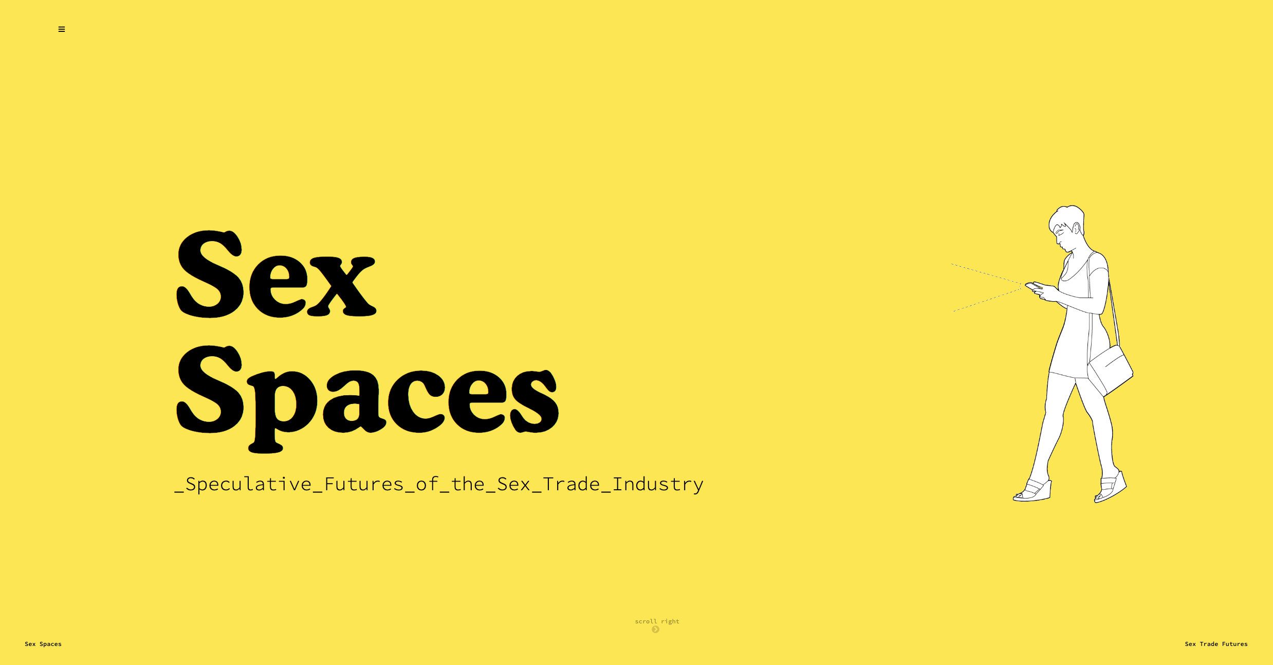
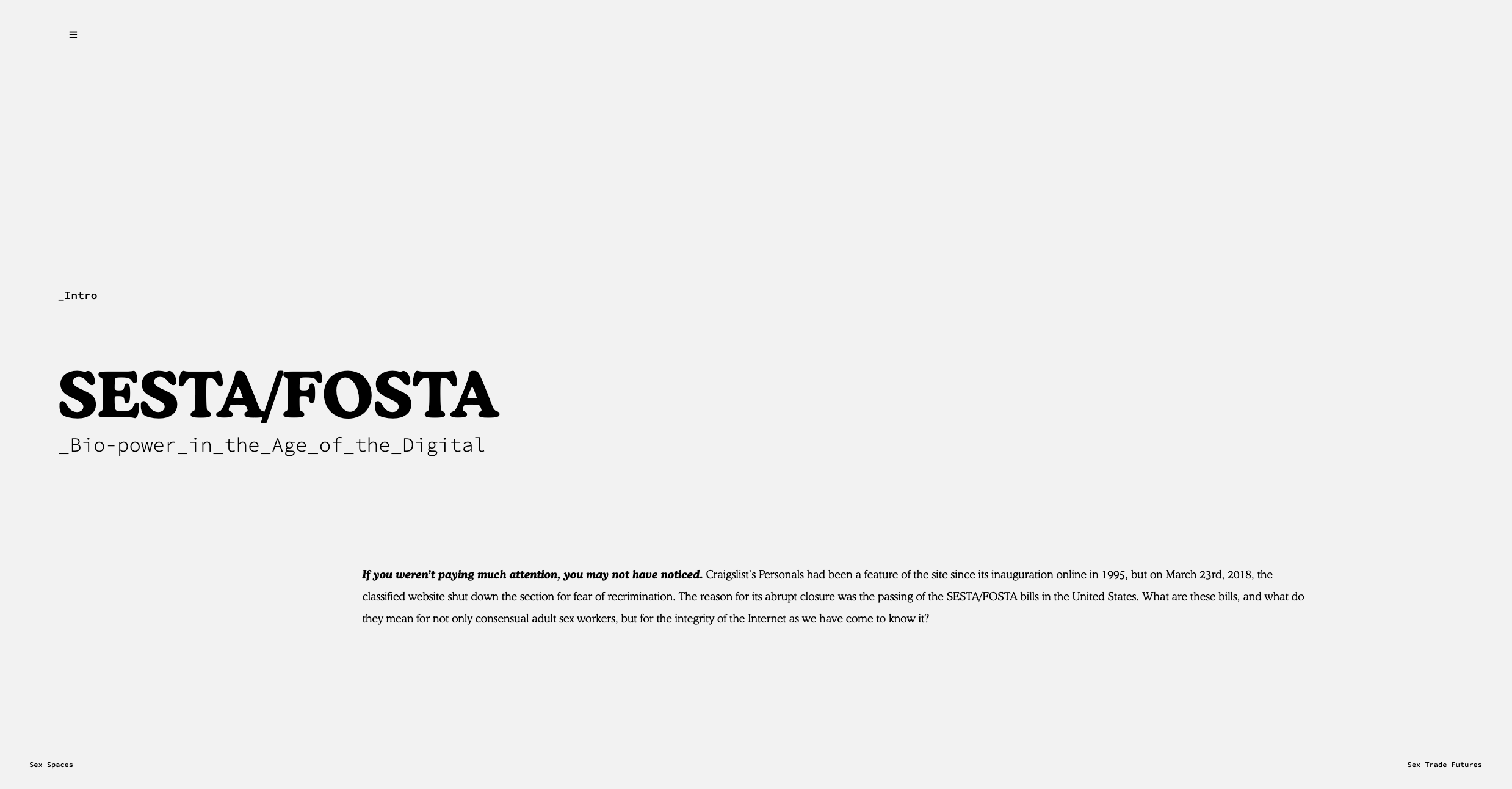
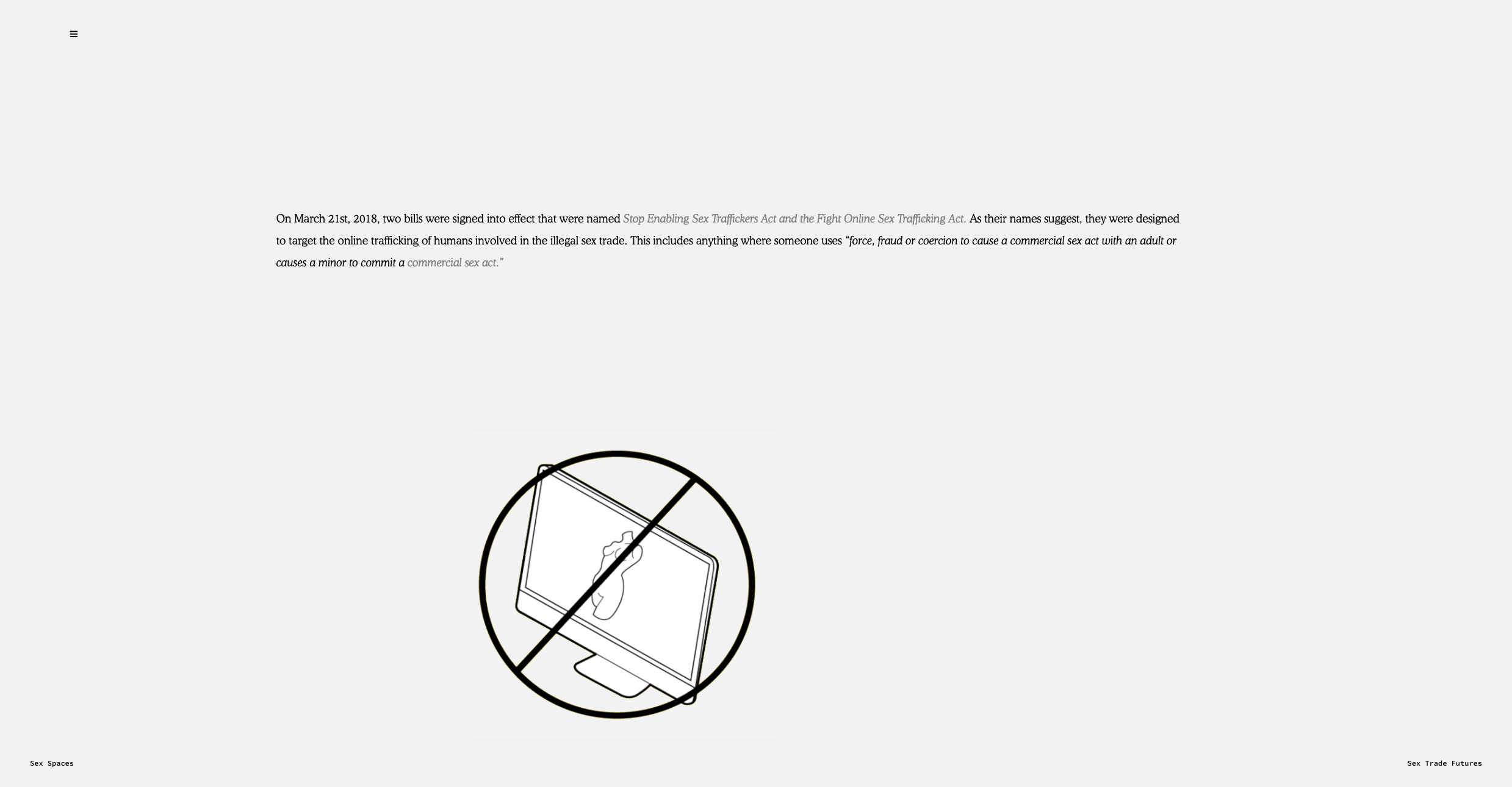
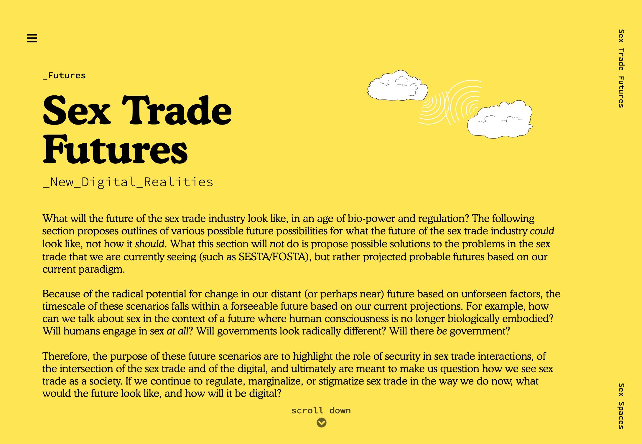
This personal prpject website was created in response to the passing of the SESTA/FOSTA bills in the US, which effectively cause a shift legal liability of websites, as well as having detrimental effects on the health, safety and livelihood of adults in the sex trade. Animations support the text.
Date: April 2019
Client: Personal project
Role: Web design, graphic design, animation, content creation
URL: /sex_spaces
The aim of this website was to explore, with the aid of moving illustrations, the consequences of government regulation in the sex trade industry and the intersection of the sex trade and digital culture.
I wrote the text from my own research of the topic, after having become interested in it in early 2018 when SESTA/FOSTA bills were passed. I felt that this was good subject matter to explore for a web-based project, as a large theme of the subject related to the Internet.
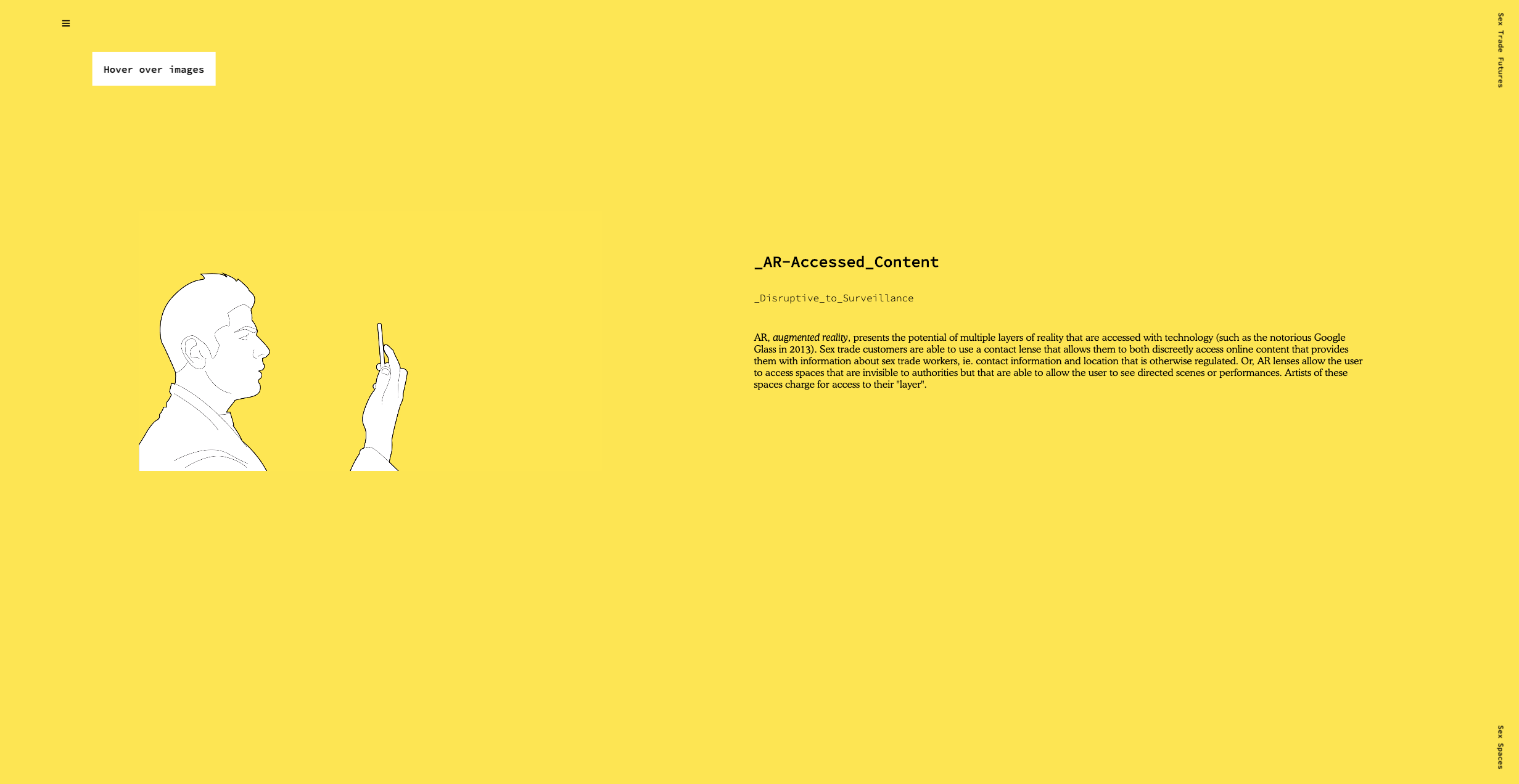
The animated gifs of the speculative futures pages are designed to compliment the text. I aimed for the visual style of the website not to elicit strong oppositional feelings in the reader, but rather to present an educational, no-frills and informative exploration of a subject that is clouded by controversy.
Following from this decision, the illustrations were inspired by simplified technical drawings (not particularly sexy), to remove the subject from its taboo.
Website redesign for a research-creation institution from Concordia University, dealing with fine arts, digital culture and information technology.
Date: October 2019 - ongoing
Client: Milieux Concordia
Role: Web design, illustration
URL: milieux.concordia.ca
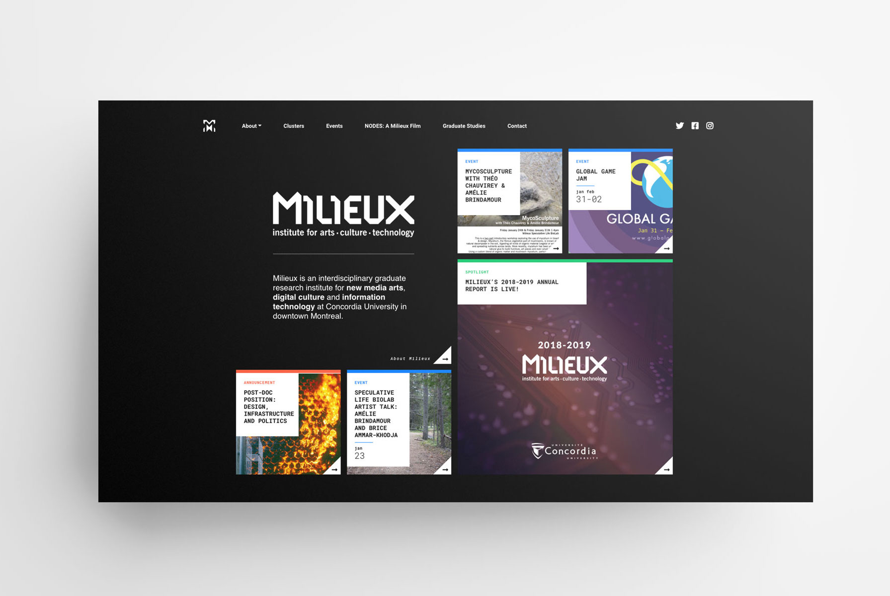
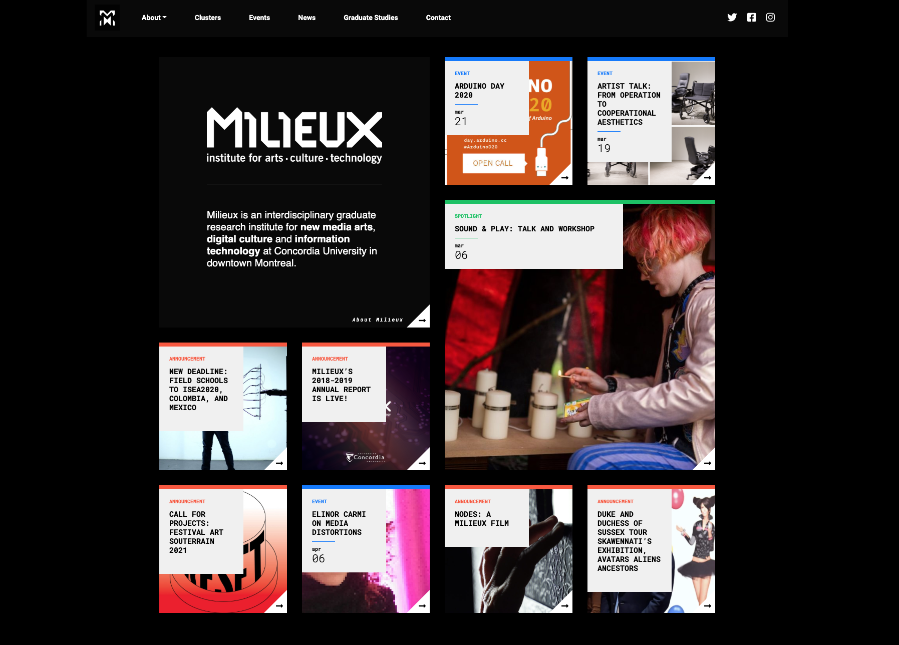
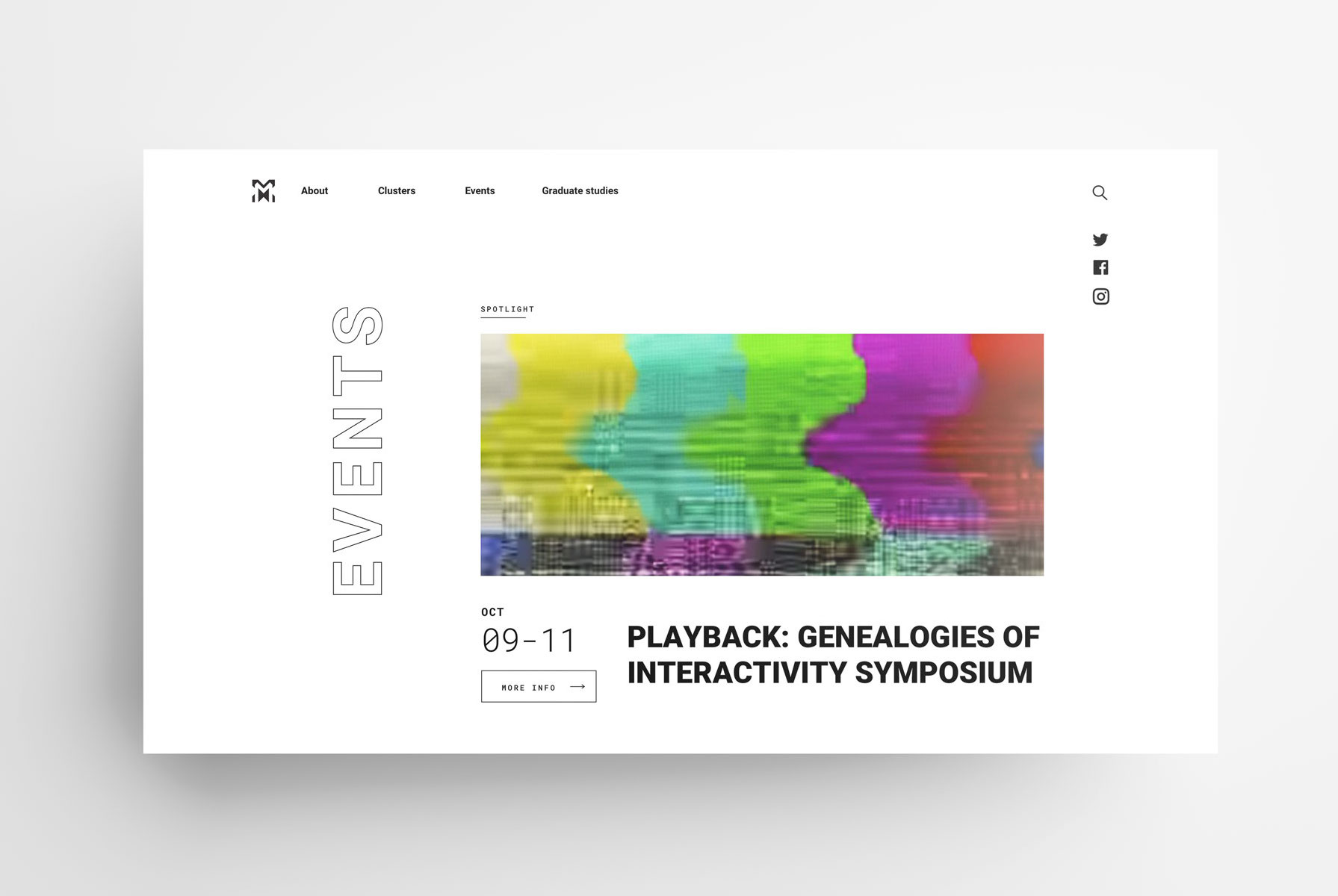
The homepage, populated with announcements, events, and spotlight.
I was commissioned to create a design that united disparate design elements of this initiative's website. The concerns that initated the project were that individual pages did not feel as though they belonged within the whole of the site, as well as conveying a sense of the variety of the projects that Milieux touched, as one major complaint was that the website felt sparse. Because of the interdiscipliarity of the institute, there was also a need to properly illustrate the different areas of research focus.
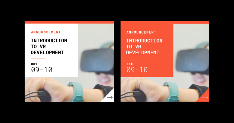
Inactive and hover states of the content boxes featured on the front page grid of the website
Milieux’s identity was in their black and white scheme. However, we decided to add some additional colours to compliment the overall aesthetic. The orange-red, violet, green, and turquoise colours were selected because they are secondary colours, which emphasized the blending of disciplines that Milieux was focused on facilitating. These colours would also help to visually distinguish between different types of content on the homepage, for example.
The Institute was already using Roboto for their online and print content. By introducing Roboto Mono as a secondary typeface to emphasize certain elements, they were able to keep a majority of print and digital assets, while also introducing this monospaced family to give more of a sense of the "digital" aspect of their activities.
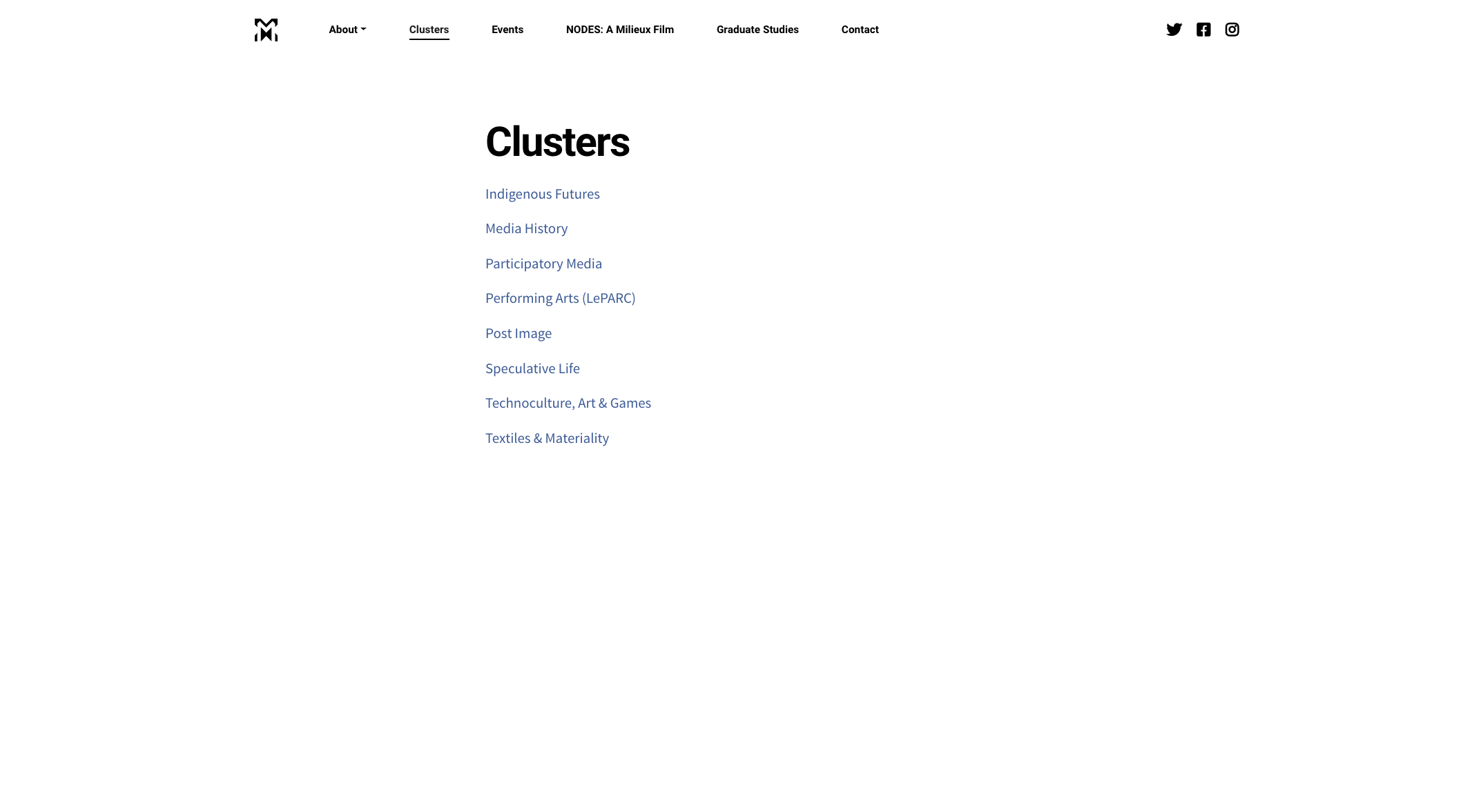
The original "clusters" page
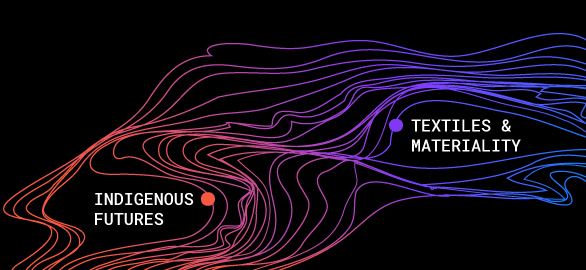
A large aspect of the redesign was in developing a graphic representation of the various streams within the Institute. The original page linked to external sites for each cluster, but did little to utilize the space in an engaging way.
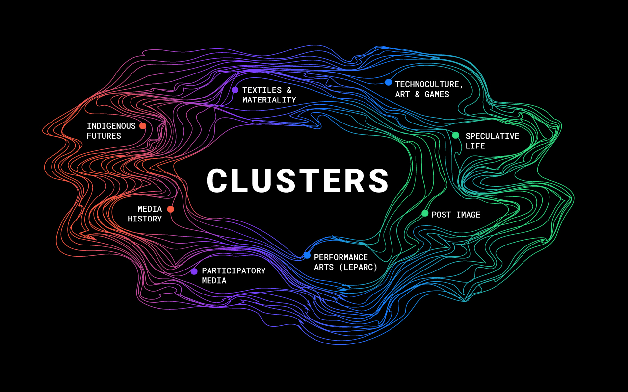
The final illustration of the Clusters page
The final illustration I created emphasized the interrelated nature of each of the clusters. I used the colours from the homepage. The strong black and white of the brand was also retained, while the newly-introduced colours were allowed to come forward, too. The colours bled into one another, as though they were fundamentally connected.
Closeup of the illustration
During the initial stages of the project, the team also brought up their desire for a shape that felt organic, yet that felt digital. In keeping with this, the final graphic was based on a network/web.
Logo and brand guide for a startup dealing with mesuring risk associated with climate change and water risk on investment portfolios.
Date: June 2019
Client: Aquantix
Role: Branding
URL: aquantix.ai
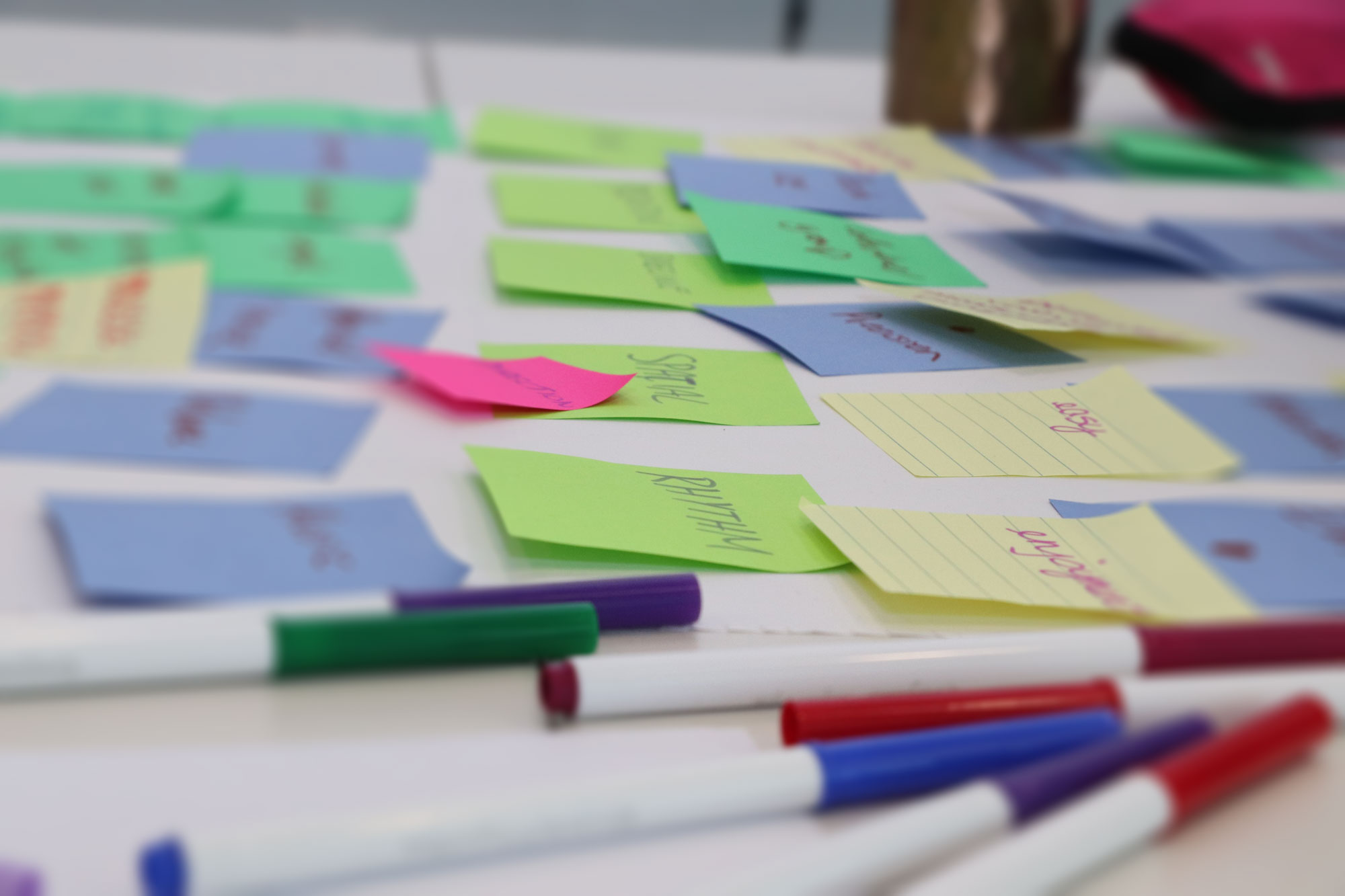
Working at an innovation centre with a startup accelerator program, I began working on this project on Aquantix with the goal of improving their brand, which they felt didn't comminucate their company's mission or industry well. Working in a small team with people with backgrounds in business and engineering, we were tasked with ideating, testing and validating a new brand system.
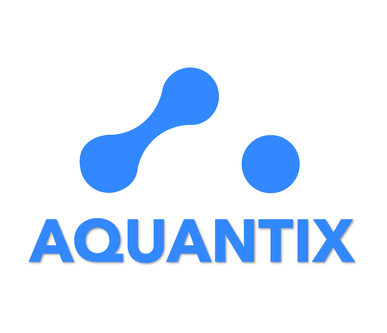
Left: the original Aquantix logo
The process began by identifying the key features of the company, and comparing this to how the original logo performed at communicating them. We determined that it was important to put the fact that the company deals with water risk at the forefront of the design.
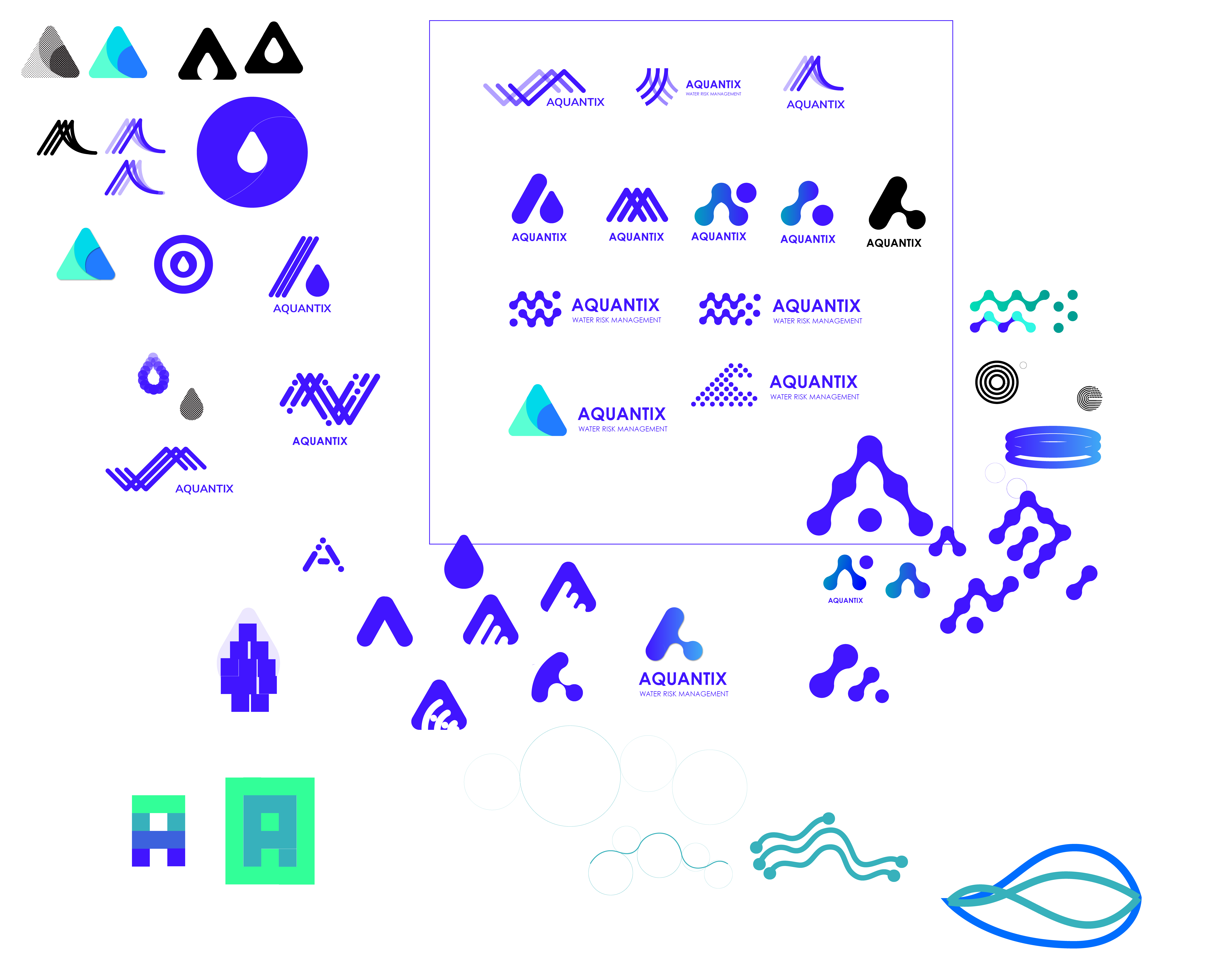
A large variety of shapes and directions were explored during preliminary stages of design
We decided to focus on the logoform before the colours in the beginning stages. Research was also done to ascertain what other competitors were doing for their branding, as well as obtaining branding preferences from the founders.
From these early experiments, approximately eight potential logos were selected to proceed to test with users. We performed casual street tests and with people in a local café to detrmine which they felt fitted the most with our description of the company, as well as generate design preferences or associations. We conducted approximately 14 total interviews.
Some early design iterations that were popular with testers
From these tests, we narrowed our work to focus on the most popular forms. We selected the ones that testers displayed an aesthetic preference for and that fit with Aquantix's brand. We perfomed further testing, arriving at a logo that would be the final version we presented to the client.
At this point, in addition the the logo, we experimented with colour schemes and typefaces to validate with our testers.
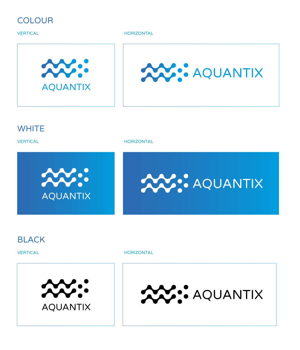
Once the final logo was decided, a brand guide was provided to the client outlining the proper use of colour, layout, padding around logo, as well as the typeface: Varela Round. Special consideration was given to the flexibility of using the logo in a variety of environments: online, in print, on merchandise, as well as large and small scales.
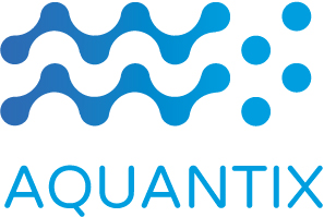
The final logo in black and colour.
The shape of the logo reflects the digital nature of the company, while the shape is remniscent of a wave, which mirrors the company's activity and name. While other colours were tested, the bright blue gradient was selected to compliment the form, and was proven to be seen as the most aligned with the brand during testing.
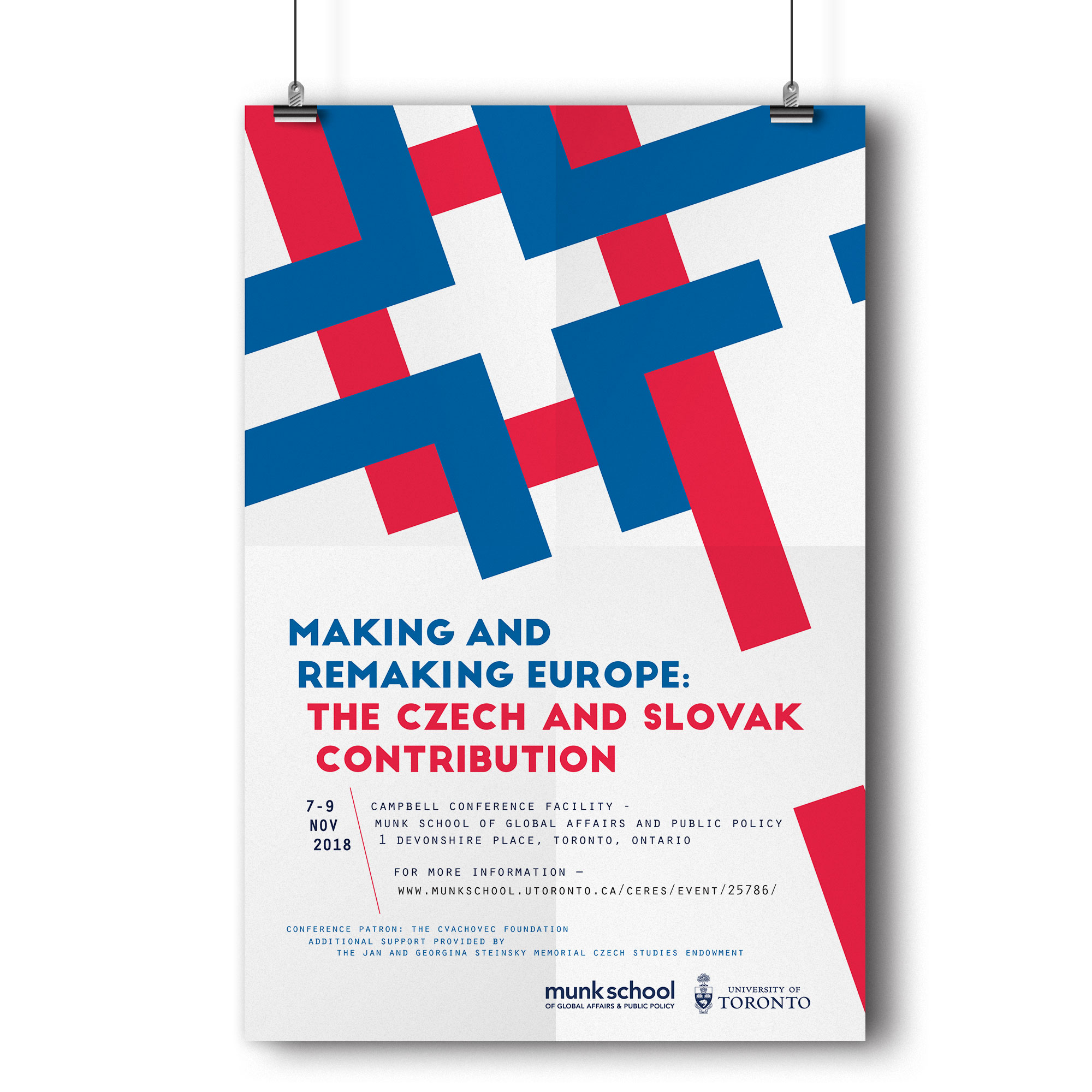
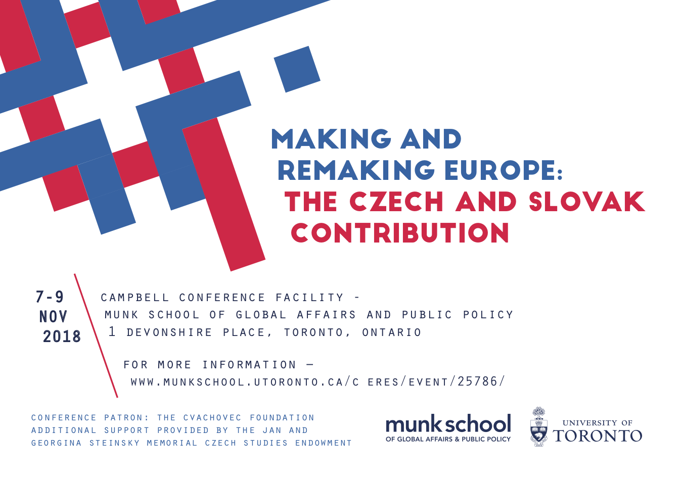
For the Making and Remaking Europe: The Czech and Slovak Contribution conference, I was commissioned to create a series of print posters and postcards, and digital promotional material for social media networks and newsletter campaigns.
Date: August 2018
Client: Munk School of Global Affairs & Public Policy, University of Toronto
Role: UI design
In identifying the primary audience as attendees of the conference and therefore were students and academics who were mostly already familiar with fundamentals of Czech and Slovak history, there was an opportunity to base the design off a historical note.
The design was also used secondarily to invite attendees to participate in the conference, and so the final design needed to be enticing in a digital environment, and communicate quickly and effectively what the conference was about: modernity meets antiquity.
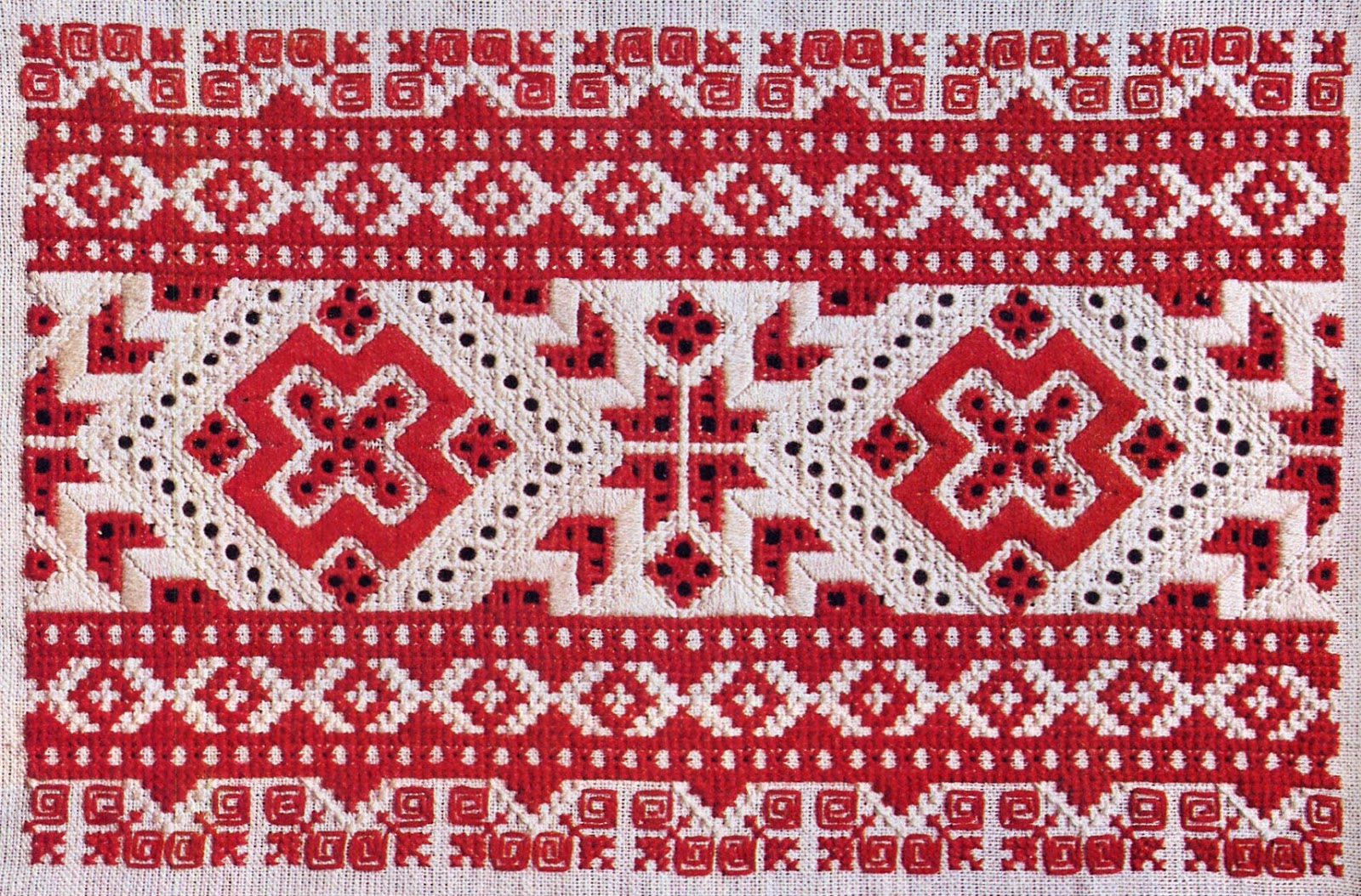
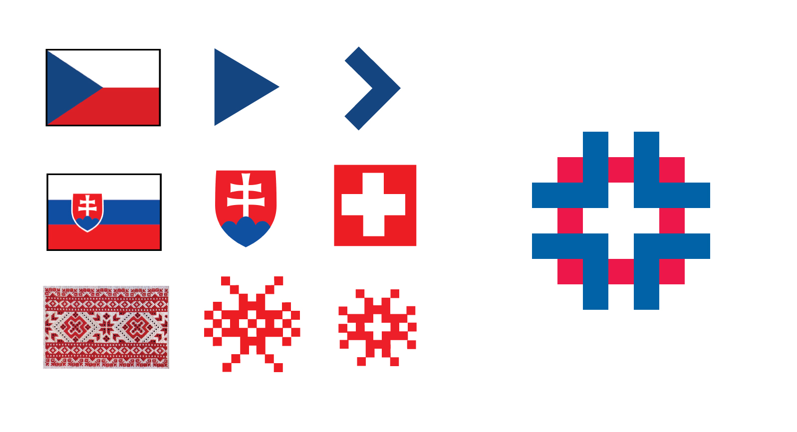
The design of the posters were based on a graphic of a hybrid of the flag of the Czech Republic, the flag of Slovakia, and traditional folk embroidery. The grid typical of embroidery in these regions was preserved to elicit an immediate visual nod to the traditional culture, and elements of both flags were blended to reinforce the underlying theme of the conference, of their dual importance in European society.
The mandate of this project was to design and create a typeface inspired from a material object. The final typeface needed to be in an appropriate file format, delivered with a printed specimen sheet to showcase its features.
Date: April 2018
Personal project
Role: Typeface design
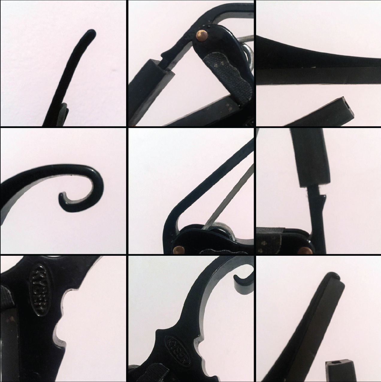
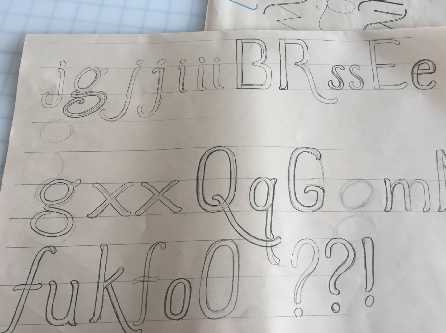
I began by chosing a beloved and intricately-shaped classical guitar capo as my inspiration for the typeface. Sketches of letterforms were made after close study of the details of the capo.
After sketching, I scanned the sheets with the best letterforms, traced them in Illustrator, and then brought those shapes into Glyphs to refine and develop into a typeface.
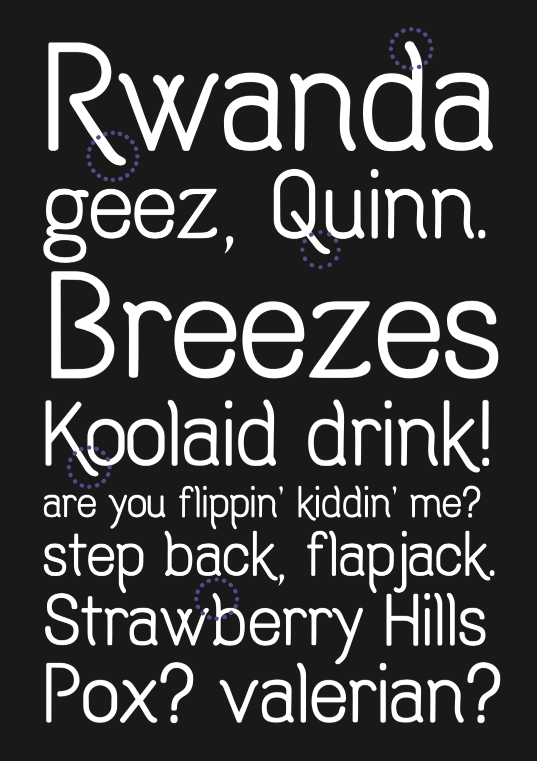
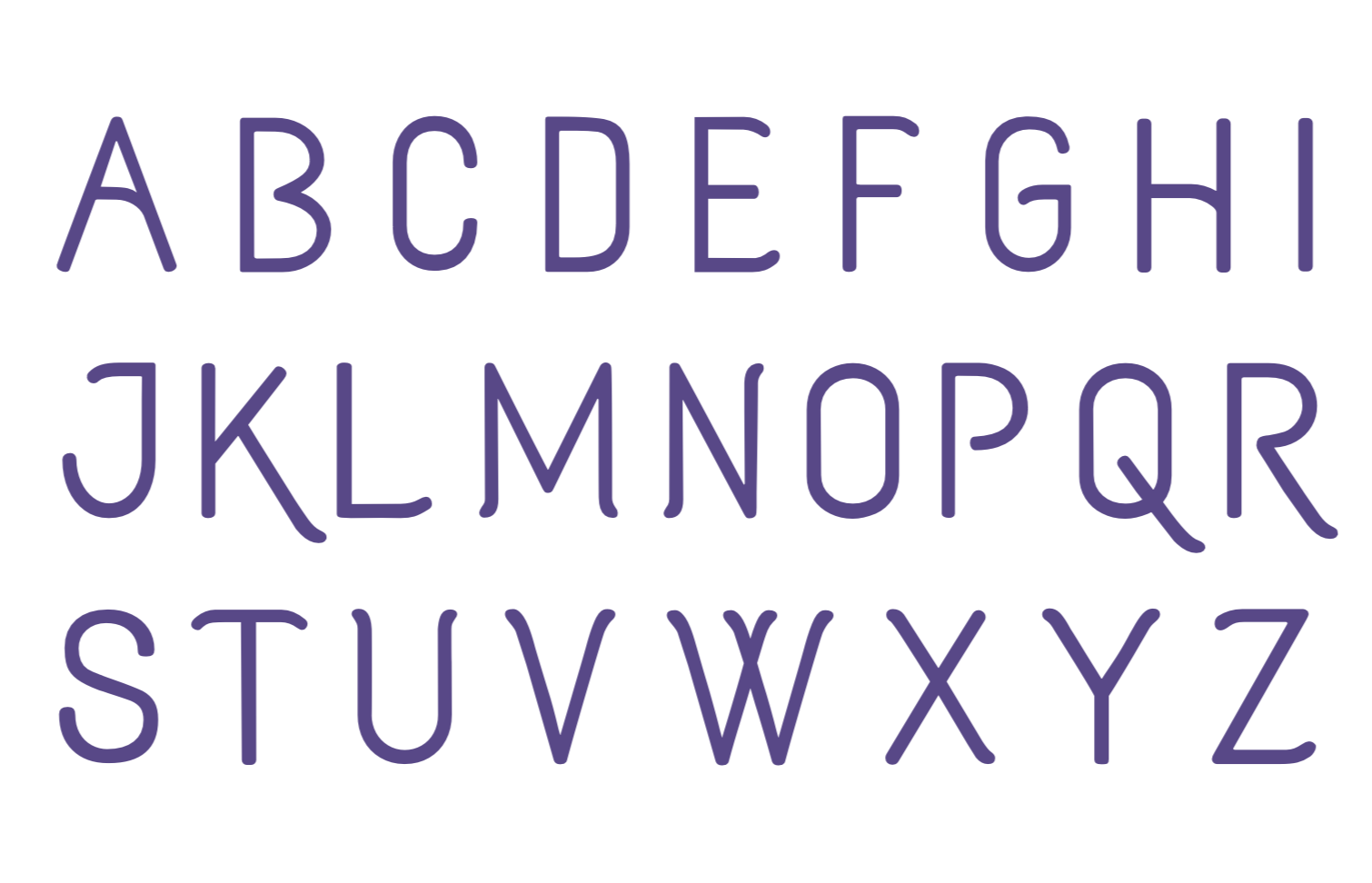
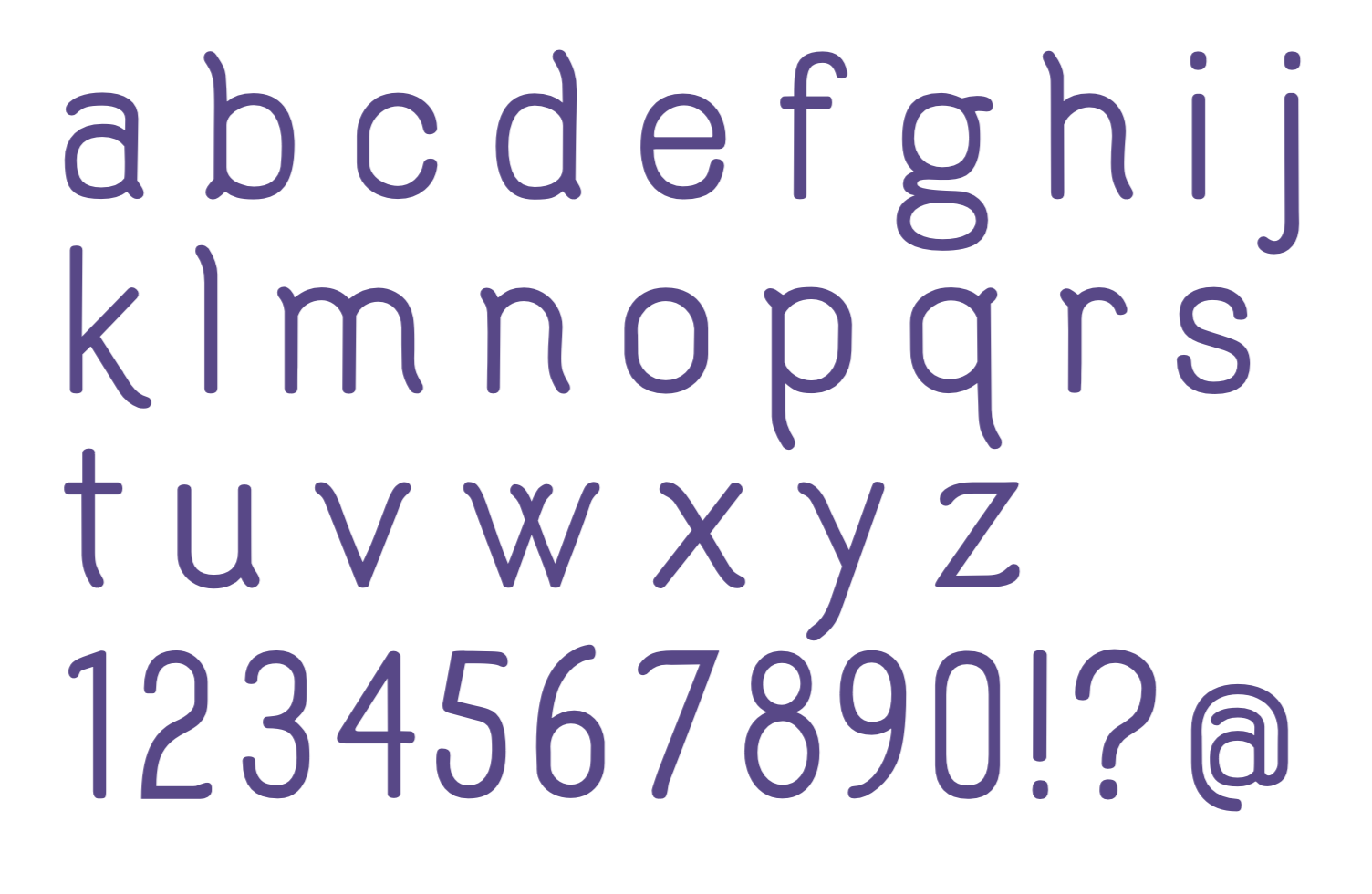
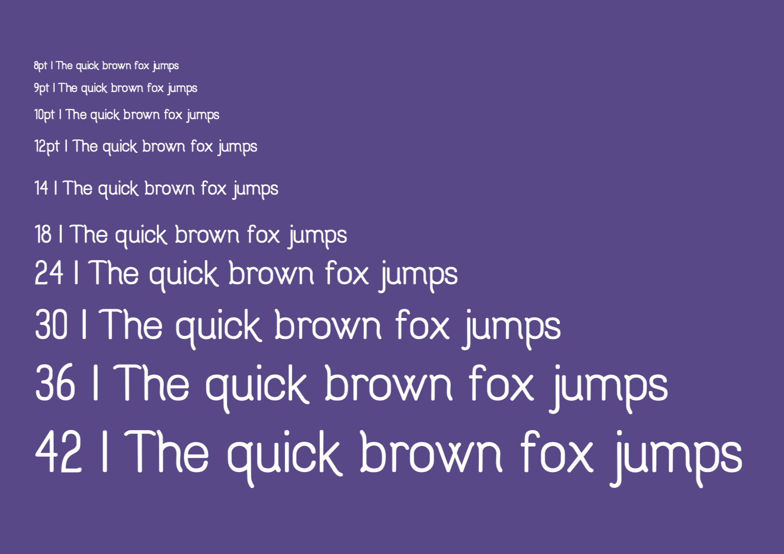
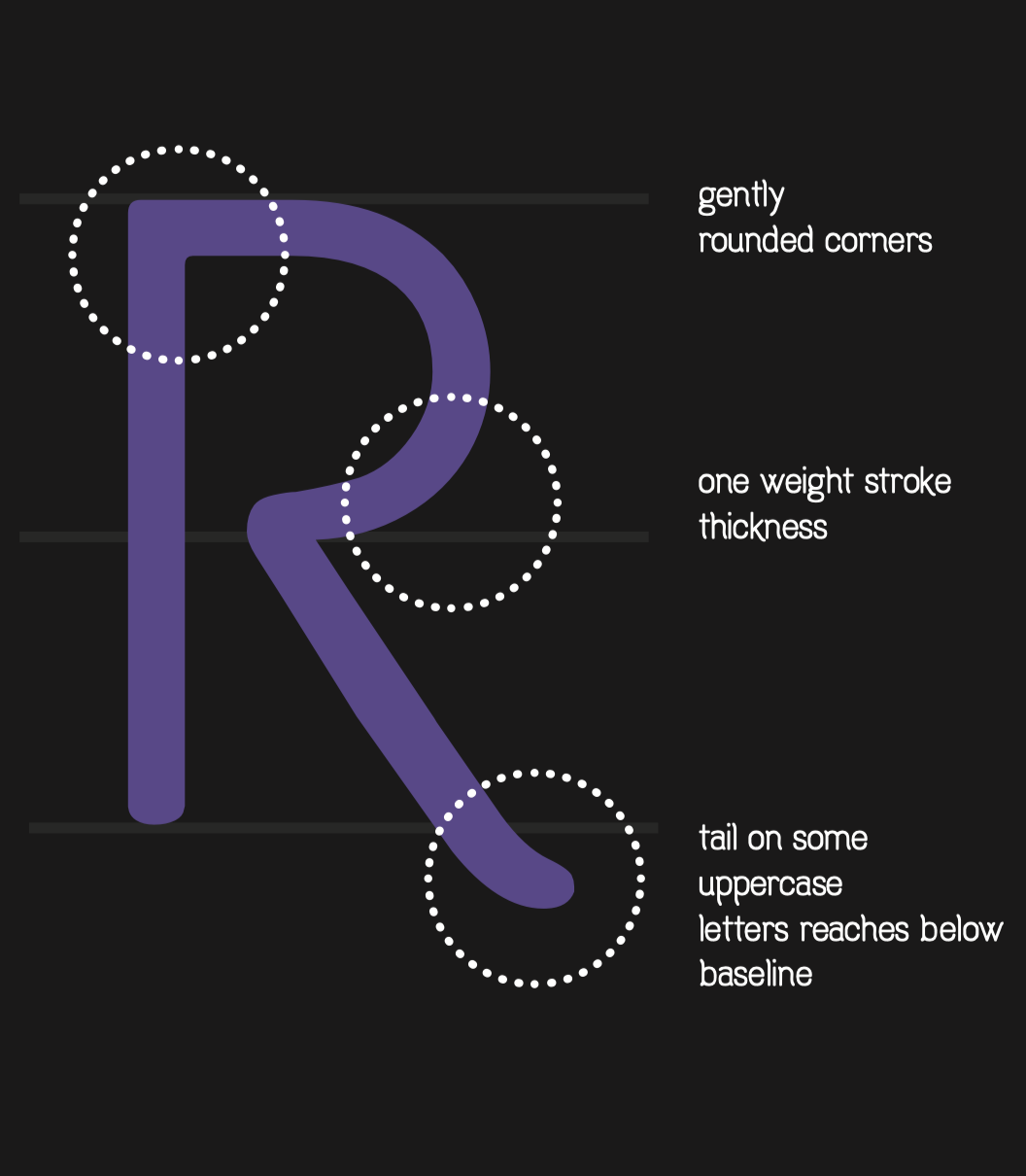
After multiple iterations, the final version of Comic Shans is a sans-serif, single-stroke typeface for display and body text. Comic Shans was designed to be playful and expressive, while being functional for short body text and display.
The name is a play on the notorious typeface Comic Sans, and my own nickname.
The mandate of this university project, was rather simple: to design and create a typeface inspired from a material object. The final typeface needed to be in an appropriate file format, delivered with a printed specimen sheet to showcase its features.
Date: April 2018
Client: Personal project
Role: Typeface design
I began by chosing a beloved and intricately-shaped classical guitar capo as my inspiration for the typeface. Sketches of letterforms were made after close study of the details of the capo.
After sketching, I scanned the sheets with the best letterforms, traced them in Illustrator, and then brought those shapes into Glyphs to refine and develop into a typeface.
After multiple iterations, the final version of Comic Shans is a sans-serif, single-stroke typeface for display and body text. Comic Shans was designed to be playful and expressive, while being functional for short body text and display.
The name is a play on the notorious typeface Comic Sans, and my own nickname.